Strength training with personal attention. How we helped turn that vision into a name, custom lettering and a visual identity for erő Strength Studio.
Before erő Strength Studio had a final name, Ashlee knew what she wanted women to find there: purposeful strength training, personal attention and a community they wanted to return to.
She was planning a women's boutique fitness studio focused on strength training in San Juan Capistrano, California, USA. She came to Jaia Studio for help with naming, logo design and the overall visual direction. The warmth she envisioned for the space and the seriousness of the training both needed to come through.
We began with naming and visual directions, then developed custom lettering, a colour palette and supporting artwork. Along the way, we tested the designs on apparel concepts and smaller placements. Seeing them in use helped us decide what to keep refining and what to set aside.
Introducing erő Strength Studio.
Why erő became the studio name
Ashlee wanted a short name she could picture on the studio and on clothing. It needed to mean something to her and leave room for the business she was planning.
Our naming guide gave us several places to start: personal meaning, the experience of being at the studio and what clients would build through training. We also considered how much the name needed to explain on its own.
The shortlist included erő, Forte, Forma and Rise. erő was already one of her ideas. The Hungarian word for strength connected to both her heritage and the work she wanted the studio to do.
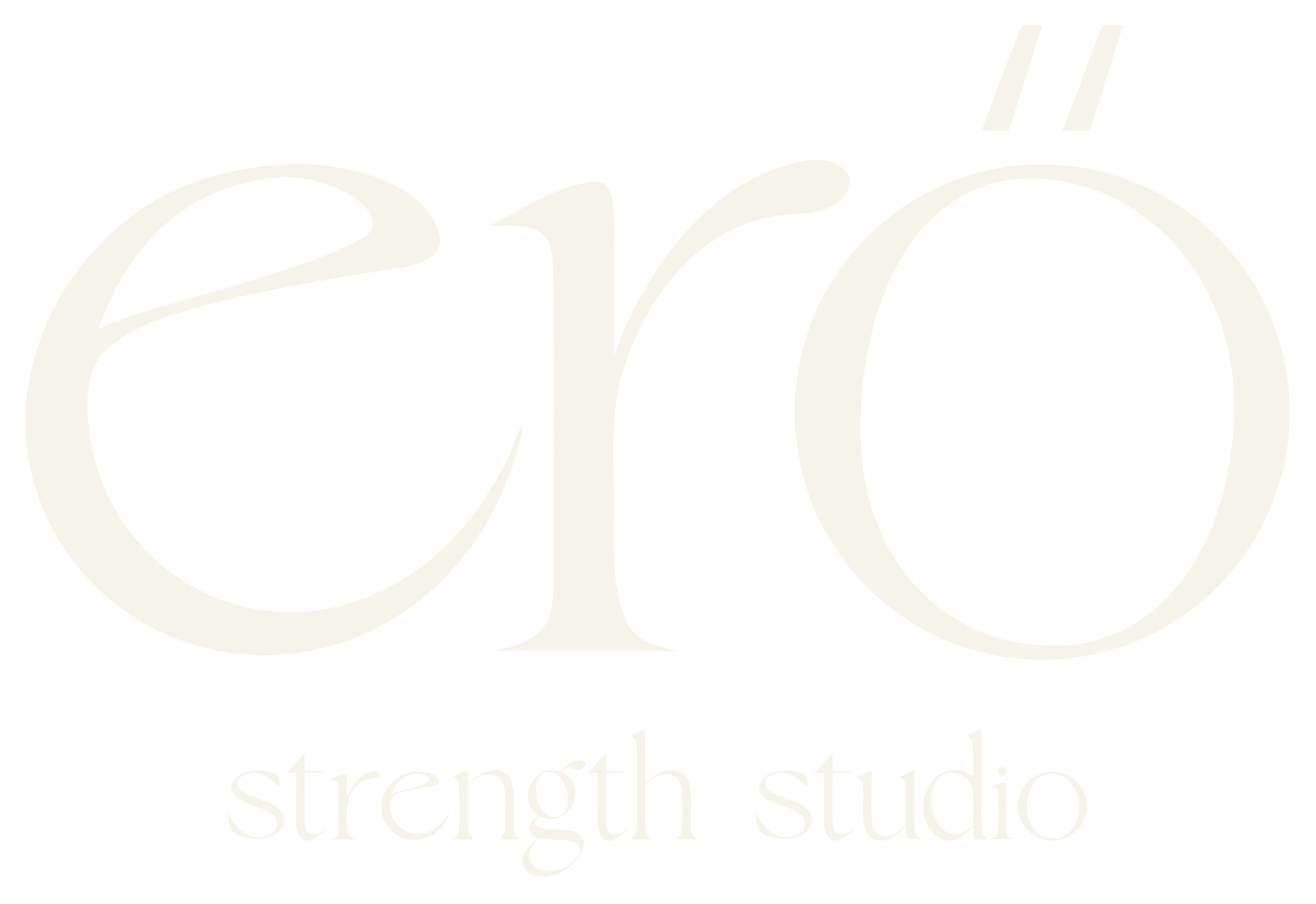
We settled on erő Strength Studio. “Strength Studio” gives someone encountering the name for the first time a clear introduction to the business. The shorter erő also works on its own in settings such as apparel, where a compact name is useful.
The double acute accent on ő is part of the spelling, so we kept it in the artwork throughout the identity.
Refining the erő lettering
Once the name was chosen, we could design around its three letters. Ashlee was drawn to softer curves and movement. We developed custom lettering with those qualities, keeping enough weight in the forms to suit a strength studio.
An earlier version connected the opening e to the rest of the name. When we reviewed it, that connection made the e harder to recognize. The detail that gave the word movement was also getting in the way of reading it.
Separating the e gave the letters more breathing room. We could keep the flowing character without asking someone to work out what the name said.
The wordmark is custom artwork. Tenor Sans and Newsreader support it in the wider identity, giving class information, descriptions and other everyday text a more readable format.
Finding a symbol that felt like erő
She also wanted a compact symbol she could eventually use without the full name beside it. We explored linked letters, circular forms and monograms, then showed them on concept hats, tanks and other applications.
Putting a mark on a hat changes how you judge it. Some studies that seemed promising on their own became too busy in a small placement. Others had the flow she liked but felt closer to yoga or Pilates than her strength training studio.
That feedback gave the next round a clearer direction: softer curves, a simpler shape and enough presence to belong beside the erő lettering. The individual e and badge versions already offered useful alternatives to the full logo. An additional symbol needed to bring something of its own.
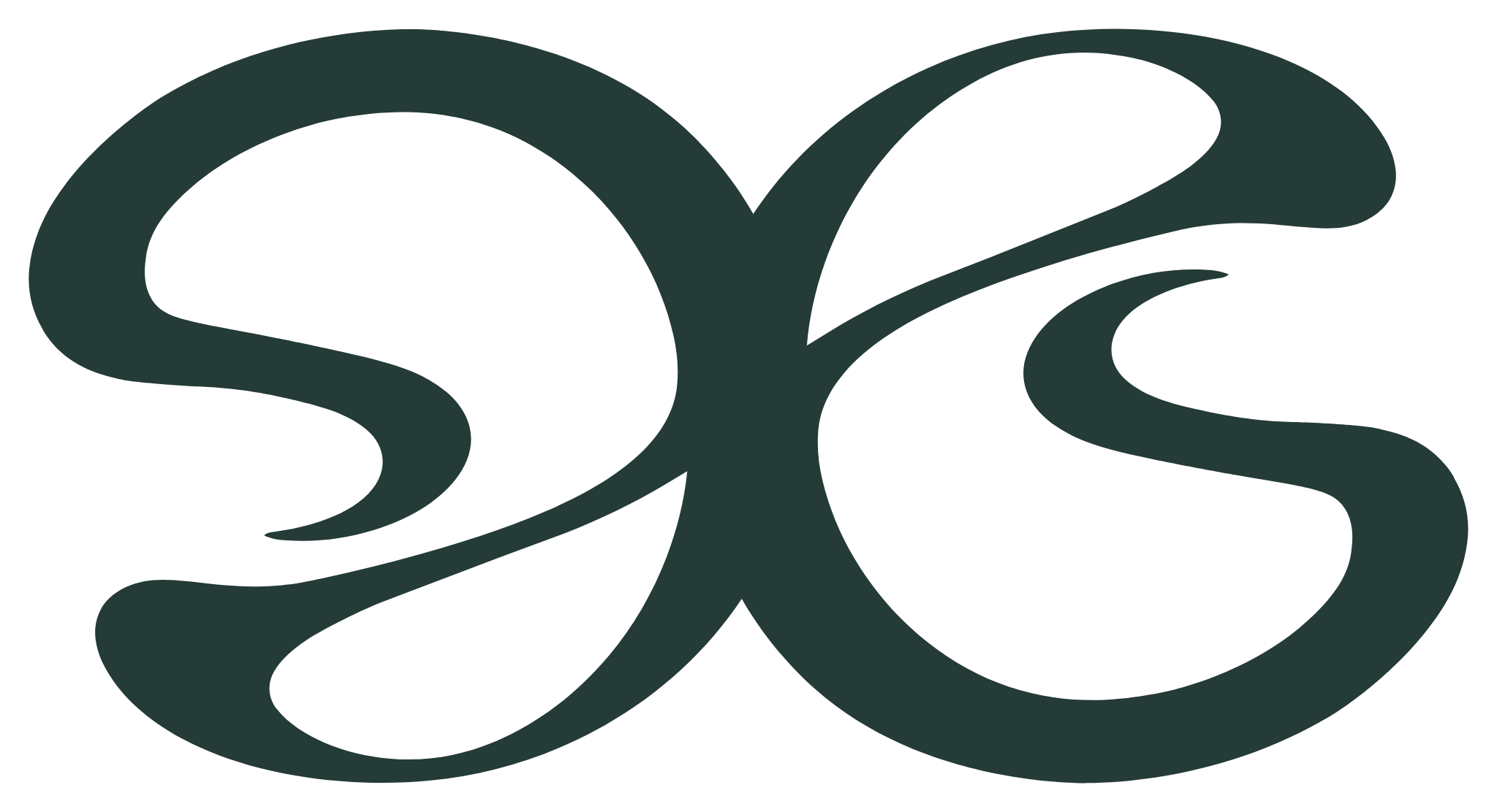
The abstract mark came through those later explorations. After seeing it in application, Ashlee could picture using it and approved the direction. It became part of the final suite alongside the wordmark, individual e and badges.
Finding the Sand & Sage palette
Ashlee was drawn to greens, warm neutrals and a lighter coastal feeling. Earlier combinations felt too dark overall, so we explored how to bring more lightness into the palette while keeping a strong dark colour for contrast.
We tested fresher blue-green notes before she chose Sand & Sage: warm sand tones, muted greens and a touch of Sea Glass. The warm woods and greenery she pictured for the space helped us judge those combinations in context.
Deep Current anchors the wordmark and important information. Foam White and the lighter neutrals let the overall identity feel open, with Sea Glass adding a cooler note. That gave us a palette with enough contrast for practical use and the lighter feel she wanted.
The Sand & Sage palette with the final abstract mark.
Giving the studio more to work with
Once the main pieces were working together, we organized them into a system the studio could use. Different logo arrangements suit wide, stacked and compact layouts, with the individual e, abstract mark and badges providing further options.
Ripple and Flow patterns extend the curved forms into larger compositions. Softer gradients offer quieter backgrounds, while hand-drawn illustrations add warmth and detail around themes of power, strength, support, balance and flow.
Those pieces give a future announcement or printed item something to draw from beyond the logo. The guidelines explain how to choose and combine them, alongside colour, typography and file guidance for the people creating the next piece.
The apparel and signage concepts helped us test scale and legibility during the project. Any physical production will still need the appropriate material samples and supplier proofs.
The erő identity, from lettering and badges to lifestyle applications.
The finished identity
Showing the work in context made feedback more useful throughout this project. We could point to a letter that was difficult to read, a symbol that felt too busy on clothing or a palette that needed more lightness. Each round had a decision to resolve.
erő now has a name connected to Ashlee's vision, a recognizable wordmark and a set of artwork she can carry into the studio's next steps. The final identity reflects both the strength of the training and the care she wants women to experience there.
If you're planning a studio identity, include the first places it needs to appear in your brief. Your designer can account for those uses while developing the brand. Our guide to what a brand needs beyond its logo explains more about those supporting pieces.
Opening a studio or ready for your brand to catch up with the business? Jaia Studio helps boutique fitness studios with naming, logo design and a visual identity for their marketing. Tell us about your studio, what you need and when you're hoping to launch.