
erő Strength Studio
Visual Branding · 2026
Naming and visual identity for a women's boutique strength-training studio in San Juan Capistrano, California. A brand shaped around personal attention, purposeful training and community.
- Women's boutique fitness and strength training
- Naming direction, visual identity, logo suite, brand marks, colour, typography, patterns, custom illustrations and brand guidelines
- San Juan Capistrano, California, USA
Strength training with personal attention.
Ashlee was planning a women's boutique strength-training studio in San Juan Capistrano, California. She wanted personal attention and community to be part of the experience from the start. She came to Jaia Studio for help with naming, logo design and visual direction. The identity needed to feel welcoming while taking the training seriously.
A short name with a personal connection.
We explored names through their meaning, the studio experience and what women would build through training. erő was already one of Ashlee's ideas. The Hungarian word for strength connected to her heritage and the business she wanted to create. We settled on erő Strength Studio. The full name explains the business; the shorter erő works on clothing and other compact placements. The double acute accent on ő stays in the lettering.
From custom lettering to a studio's everyday materials.
We refined the curves and spacing of the three letters so the name felt flowing and stayed easy to read.
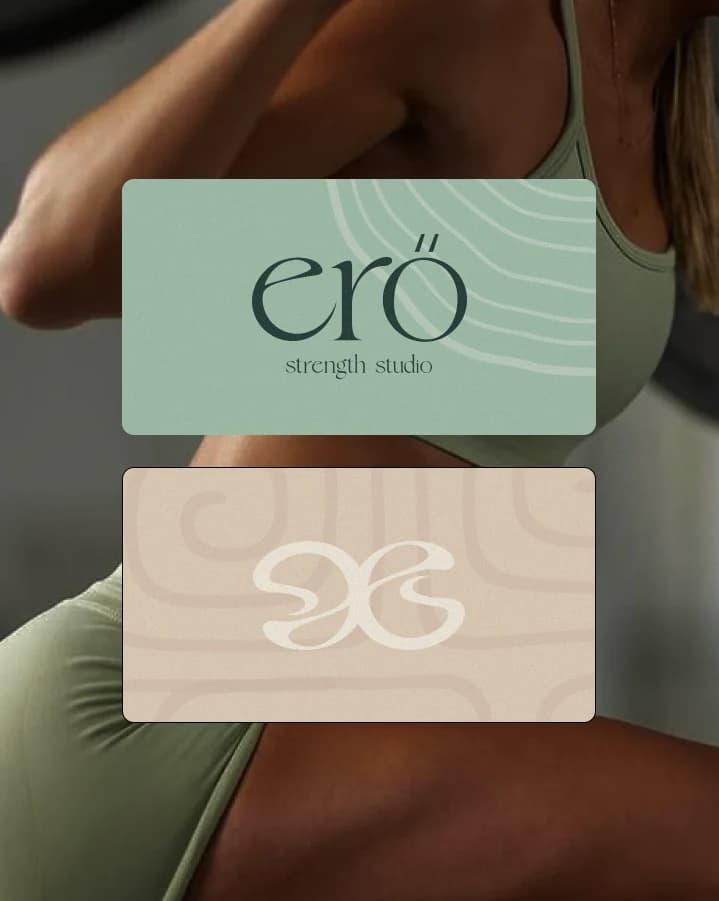
The individual e, abstract mark and badges give the studio smaller ways to use the identity. You can see the lettering and patterns together in the class-card concept.
Sand & Sage, with room for contrast.
Ashlee chose a lighter palette of warm sand tones, muted greens and Sea Glass. The woods and greenery she envisioned for the studio helped guide the direction.
Deep Current gives the logo and text contrast. Foam White and the lighter colours leave room for photography, patterns and information.
A system the studio can keep building with.
Flowing patterns, gradients and hand-drawn illustrations give the studio artwork to draw from for future materials.
The brand guidelines explain how to use the logos, type, colours and supporting artwork. Apparel and signage concepts helped Ashlee picture how those pieces could work in the studio.
- Naming exploration and direction
- Custom wordmark and logo suite
- Brand marks and badges
- Colour and typography
- Patterns and custom illustrations
- Brand guidelines and application direction
The identity in a launch Story.
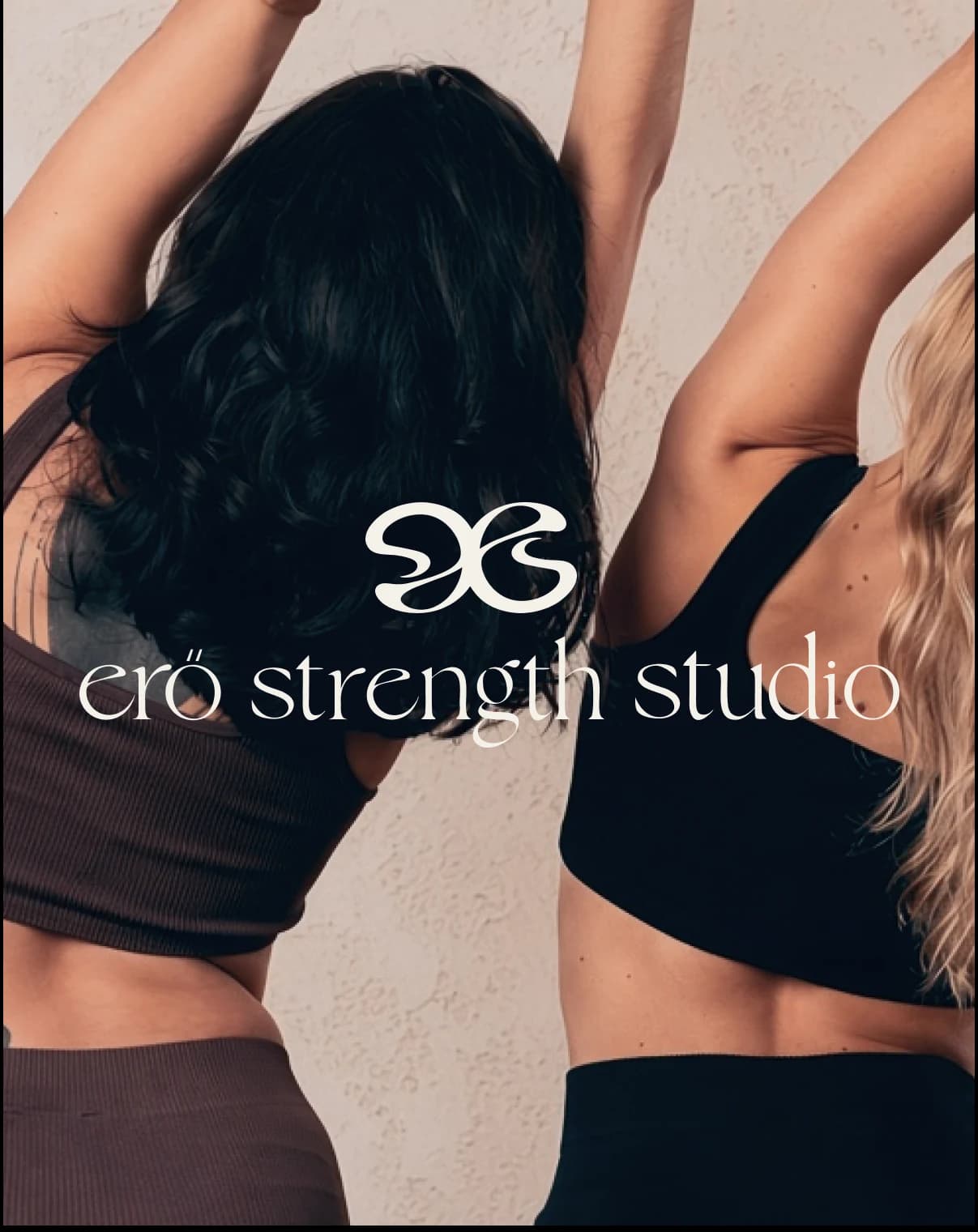
A short Story brings the wordmark, marks, colour and studio message together on a phone screen.
The erő identity in use.

Want to see how the decisions came together? Read the erő naming and design story.
Planning your own studio identity? See what's included in Jaia Studio's visual branding services.
The identity, ready for its next steps.
- erő has a name connected to its founder's vision, a distinctive visual identity and guidance for using it as the studio develops.
Branding your boutique fitness studio?
Jaia Studio helps boutique fitness businesses with naming, logo design and visual identity. Tell us what you're planning, what you need and when you'd like to launch.