Brand vs Logo: What Does a Wellness Business Actually Need?
A logo, a visual identity, and a brand do different jobs. See which one your wellness business should fix next.
A logo gives people something to recognize. A visual identity makes the pieces around that mark look like they belong together. A brand connects what the business promises with what people see, understand, and experience.
Design and the website sit inside that system. They are not the whole of it. A recognizable logo can stay while another layer changes. The useful question is which layer is unclear, and which later decision depends on fixing it first.
This shows up in established wellness businesses more often than in new ones. A boutique studio, clinic, therapy practice, spa, or retreat can look finished and still be hard to choose. The door sign is familiar. The homepage still describes the first version of the offer. The schedule, the team, or the rooms have grown, and the page that explains them has not. People recognize you. They can't tell what to book, or whether this place is for them.
You may not need a new logo. You may need a sentence that matches the business you run now, materials that look related, or a path from the page to a booked visit.
A logo, a visual identity, and a brand
Logo
The name or mark people recognize, on the door, the booking page, and the bag they carry out.
Visual identity
The system around the mark: type, colour, photography, and the way a service is named so the pieces look related.
Brand
The promise, held together across what people see, what they understand, and what they experience when they arrive.
If people already know the name, and it still points at the business you run, keep it. A redraw will not fix a homepage that describes the wrong offer.
Where later work depends on earlier decisions
The order below is a check, not a five-stage rebrand. Fix the earliest decision the later work relies on. A new website can't clarify an offer you have not decided. A new identity can't teach the front desk what to say. What you hear in the room can also send you back: a service people ask for and can't find, or a sentence that works in person and never made it onto the page.
Find the first layer that is unclear or inconsistent.
01Foundation Who you serve, what you offer, and how the business runs.
02Message The sentence that says who it is for and why this place.
03Identity The mark and the visual system people can recognize.
04Digital The site, the schedule, and the path to a booking.
05Experience What people meet in the room, on the phone, and after they leave.
What to check
Name the gap in a sentence you could say out loud. Then take the smallest next move the later work can rely on.
Name and mark. People still recognize you, but the homepage describes one instructor, one treatment, or a location you have outgrown. Keep the file. Rewrite the public sentence before you redraw anything.
Visual identity. The studio, the schedule, the social posts, and the site look like different businesses. Tighten the system around the mark you already have. If the pieces don't look related, start with cohesion.
Offer and message. You can't say who it is for, what it includes, and what it is not. Every service is listed, and none of them is recommended. Decide that before design or the website. If the offer itself is still unclear, start there.
Website and booking. People understand you in conversation and still can't find the service, the practitioner, or a time. Fix the path. Leave the logo alone.
The visit. The page is calm, and the front desk has to correct it. Start with the sentence the team can use. A new visual system will not teach them that.
If two layers look wrong, start with the earlier one. A prettier booking page still fails when the offer on it is undecided.
When the name had to change, and when it did not
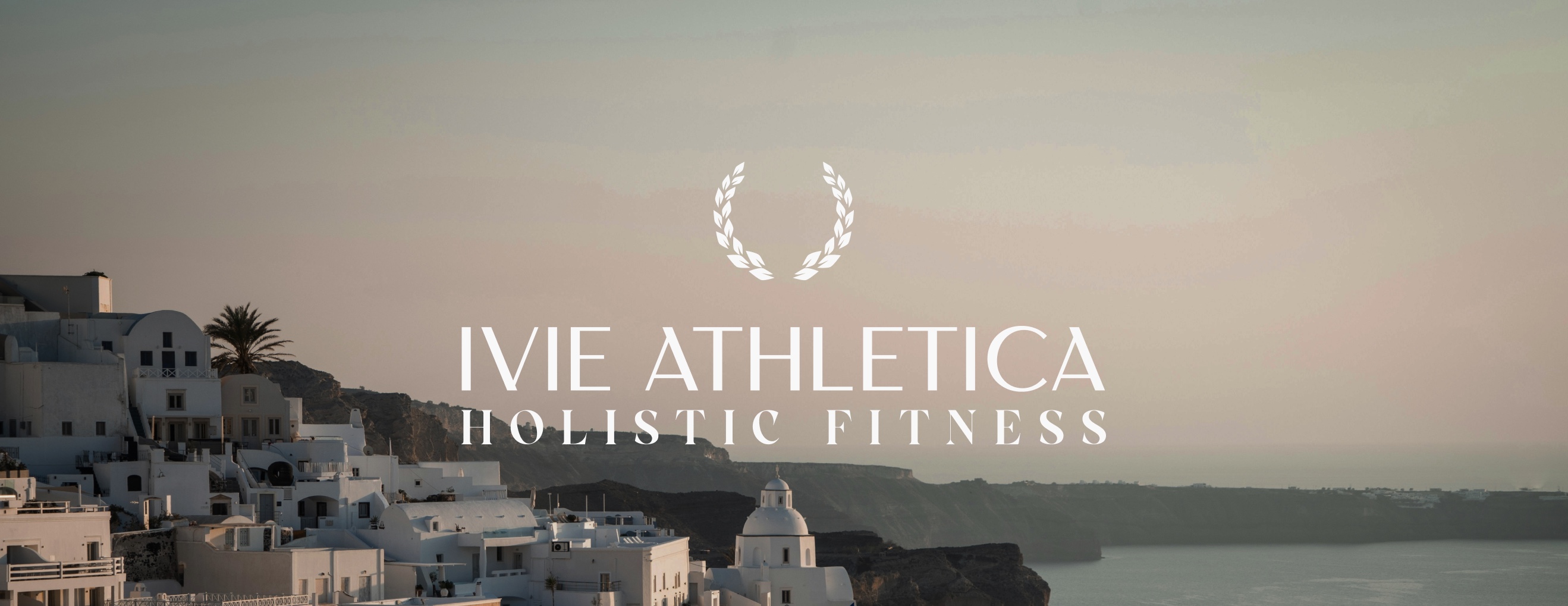
Ivie Athletica began as a personal name. The work had grown into personal training, small-group sessions, and a community, and that name could not hold the larger offer. The decision was a new name, then an identity around it: the mark, the photography, and the way the work is described. The bottle is one place that identity shows up. It is not the reason the name changed.
The wordmark and laurel belong to one identity. The name changed because a personal name could not hold the offer.
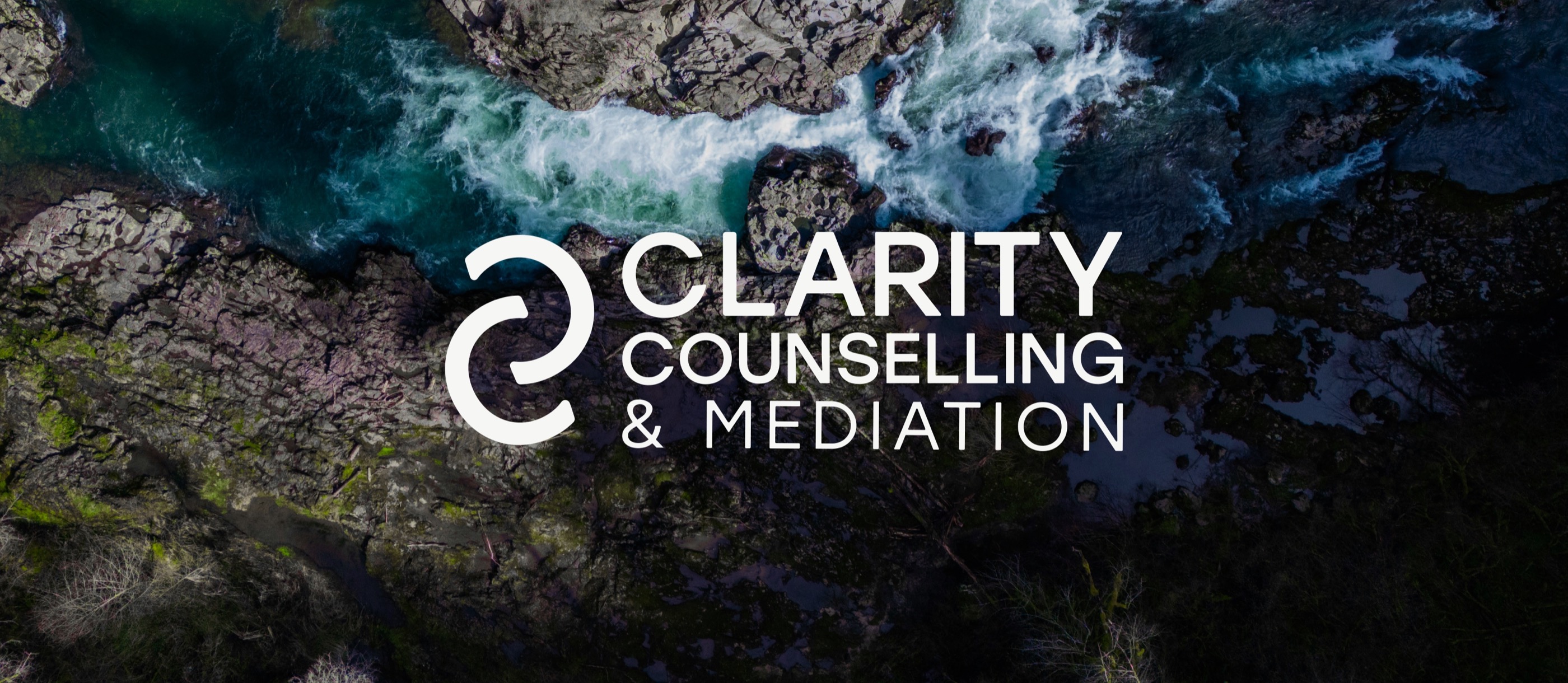
Clarity Counselling kept its name. The clinic in Galt and Cambridge already had one. Several therapists needed the services to read as one practice: individual, relationship, student, and children's counselling, plus mediation. Custom icons sort that offer into a path someone can inquire through. They don't replace the decision about what the clinic is.
The name stayed. The mark is what people recognize across the practice.
One name could not hold the offer. The other name could. The work followed that fact.
What to do next
You don't need every layer rebuilt. Keep an accurate name. Tighten an identity that doesn't look related. Decide who the offer is for before you hire for a website or a logo. Fix the path when people already understand you and still can't book. Start with the team's sentence when the visit doesn't match the page.
Choose the earliest decision that is still open. The rest of the work gets simpler after that.
Work with Jaia Studio
If the next step is the offer, the identity, or the website, Jaia Studio can sort out what to change and build it with you. If the gap is the visit itself, start with the sentence your team can use.