 Loading pageLoading pageLoading page
Strategy Sessions · Visual Branding · 2025
Visual identity for a movement instructor expanding into breathwork and cold exposure.
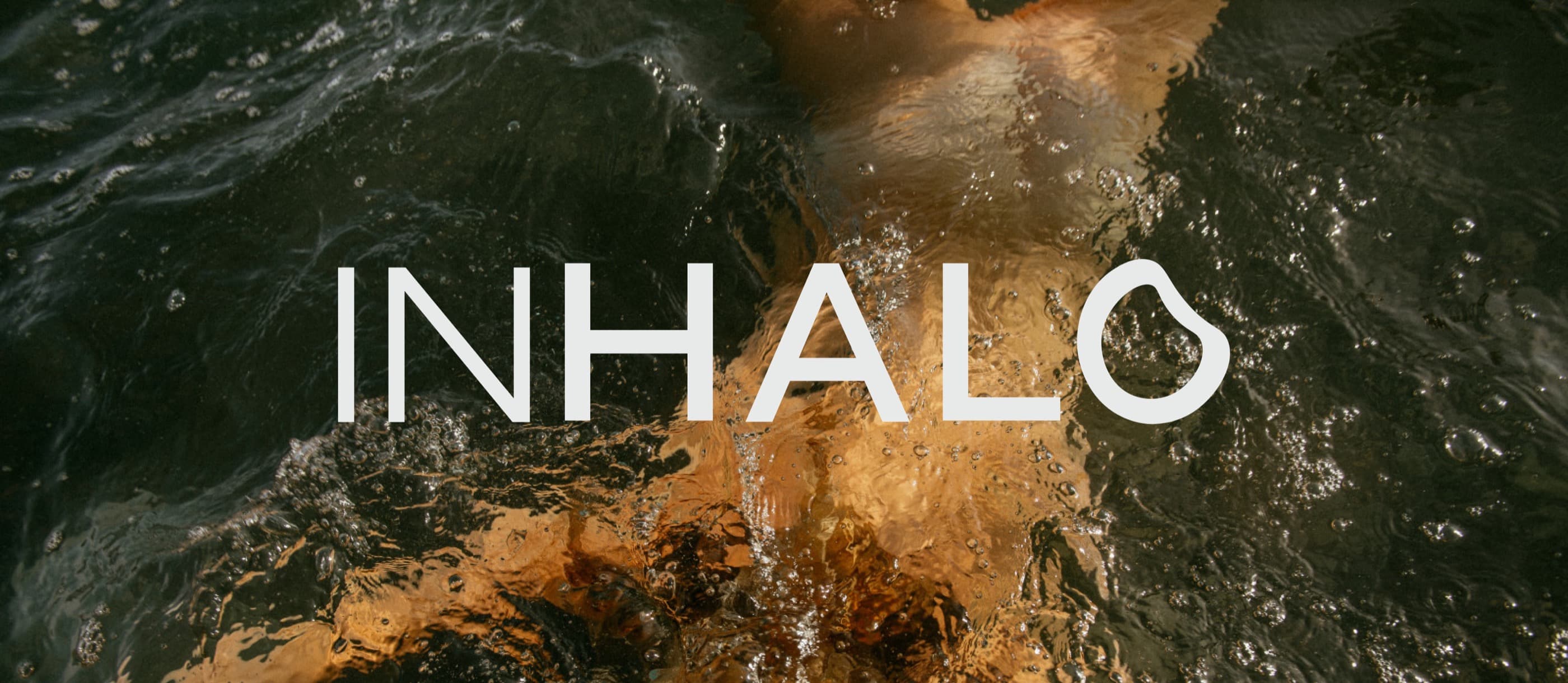
Stacy had spent more than 20 years teaching movement, from Zumba and high energy fitness classes to Pilates and barre. As her work evolved, she was moving toward breathwork, guided cold exposure, contrast therapy, and a more grounded approach to movement. After becoming a certified Cold Guide, she needed a brand that could hold this next chapter without losing the community that already knew and trusted her.
Stacy was no longer building a business around one type of class. She needed space for movement, breathwork, contrast therapy, and future wellness experiences to exist together. The challenge was creating a brand that felt grounded and spiritual without losing the strength, energy, and familiarity of the work she had already built.
These three ideas created a clear foundation for the brand. Movement held Stacy’s experience in Pilates, barre, dance, and fitness. Breath supported a slower and more intentional side of the practice. Connection brought the work back to community, self awareness, and shared experience.
The visual direction needed to hold both power and softness. The panther represents instinct, confidence, and quiet strength. The open hand represents guidance, touch, and embodiment. Together, the symbols created a visual world that feels grounded, mysterious, expressive, and strong without becoming aggressive. Deep charcoal, black, mauve, lavender, and soft neutral tones gave the identity a moody and grounded atmosphere. The wordmark, panther symbols, hand mark, and custom icons gave Stacy different ways to express the brand across movement, contrast therapy, social content, and future offers.
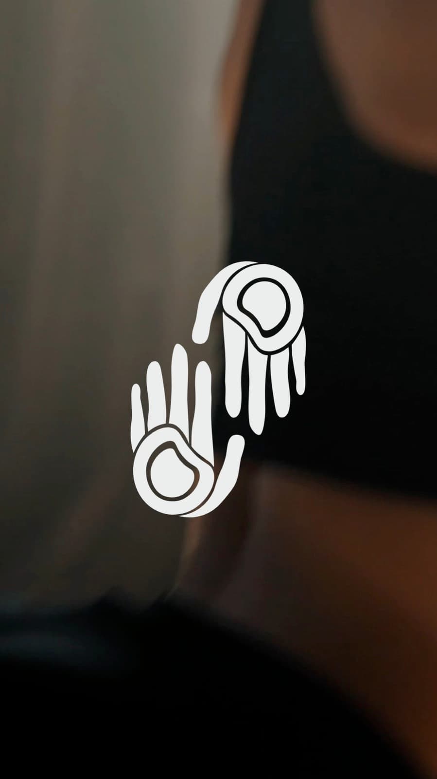
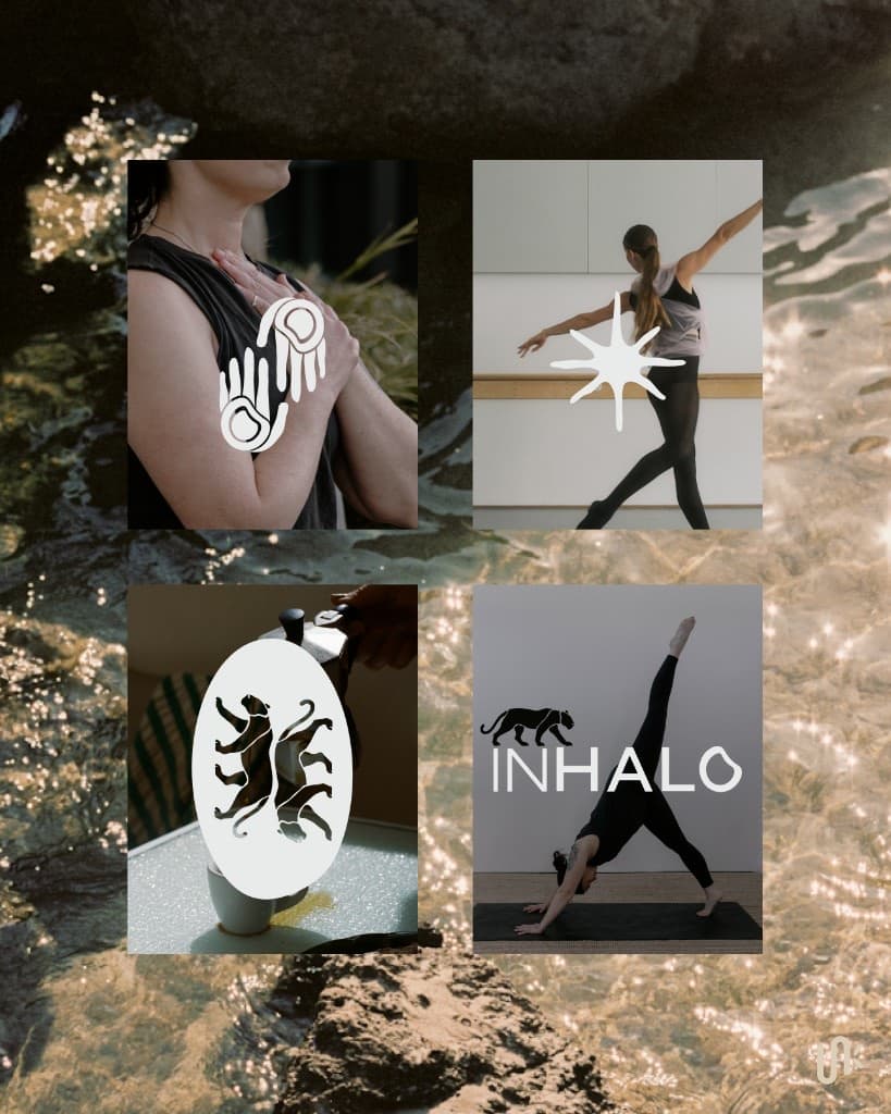
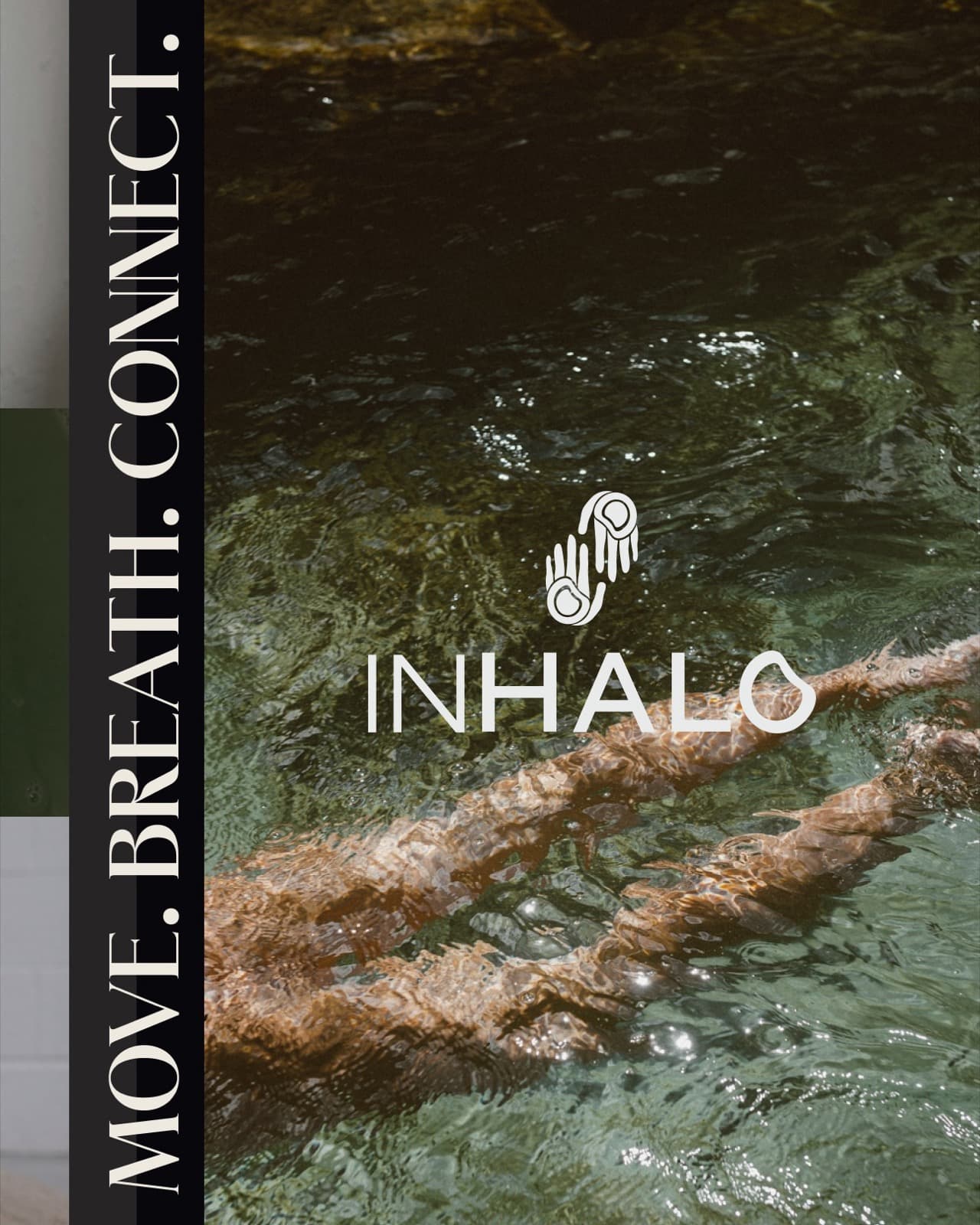
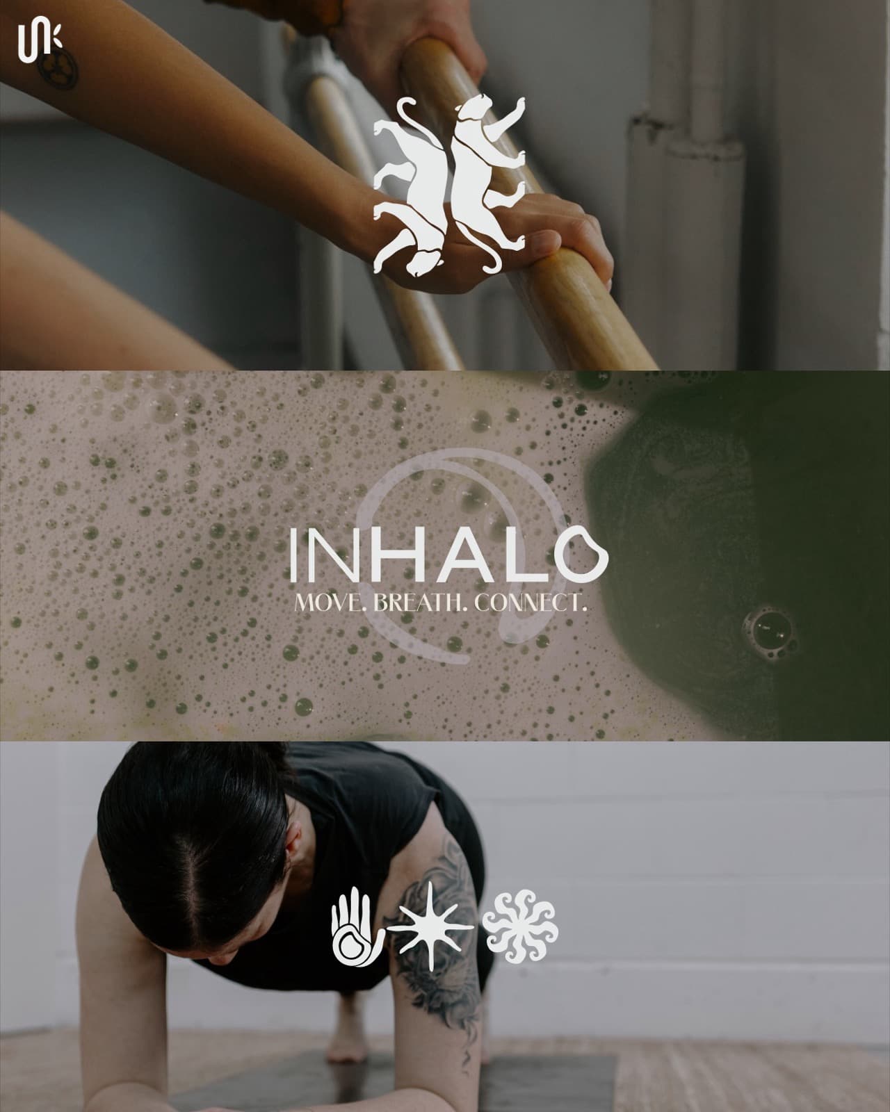
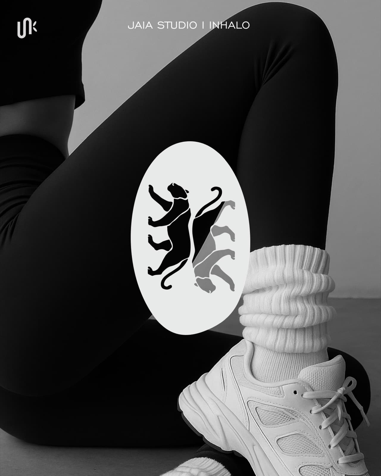
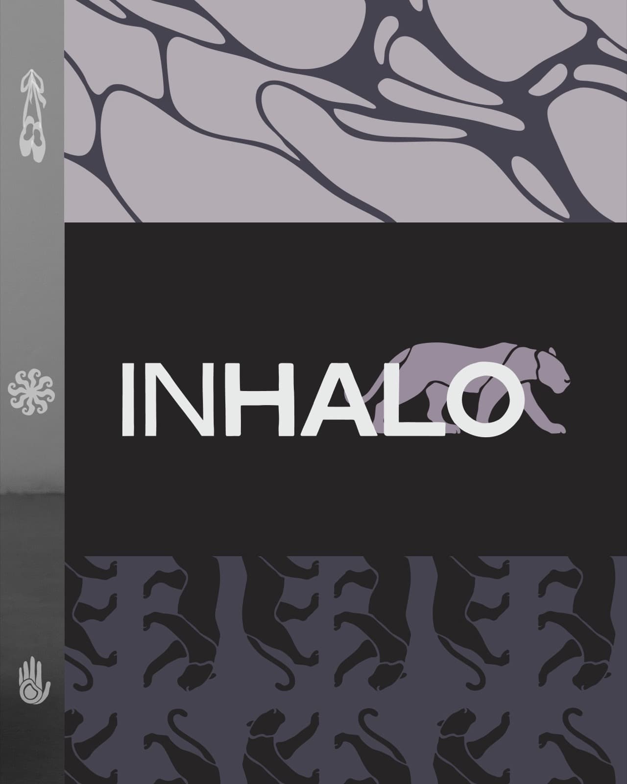
Three pinned Instagram posts helped introduce the new direction, explain the evolving practice, and give Stacy a consistent starting point for launch. The brand guidelines, mockups, icons, and social assets gave her a practical system she could continue using as the business developed.
Tell us what has changed and what is no longer working. We will tell you whether the project should begin with strategy, branding, or a full brand and website.