 Loading pageLoading pageLoading page
Visual Branding · 2024
Brand identity for a yoga and reflexology practice rooted in inner to outer wellness.
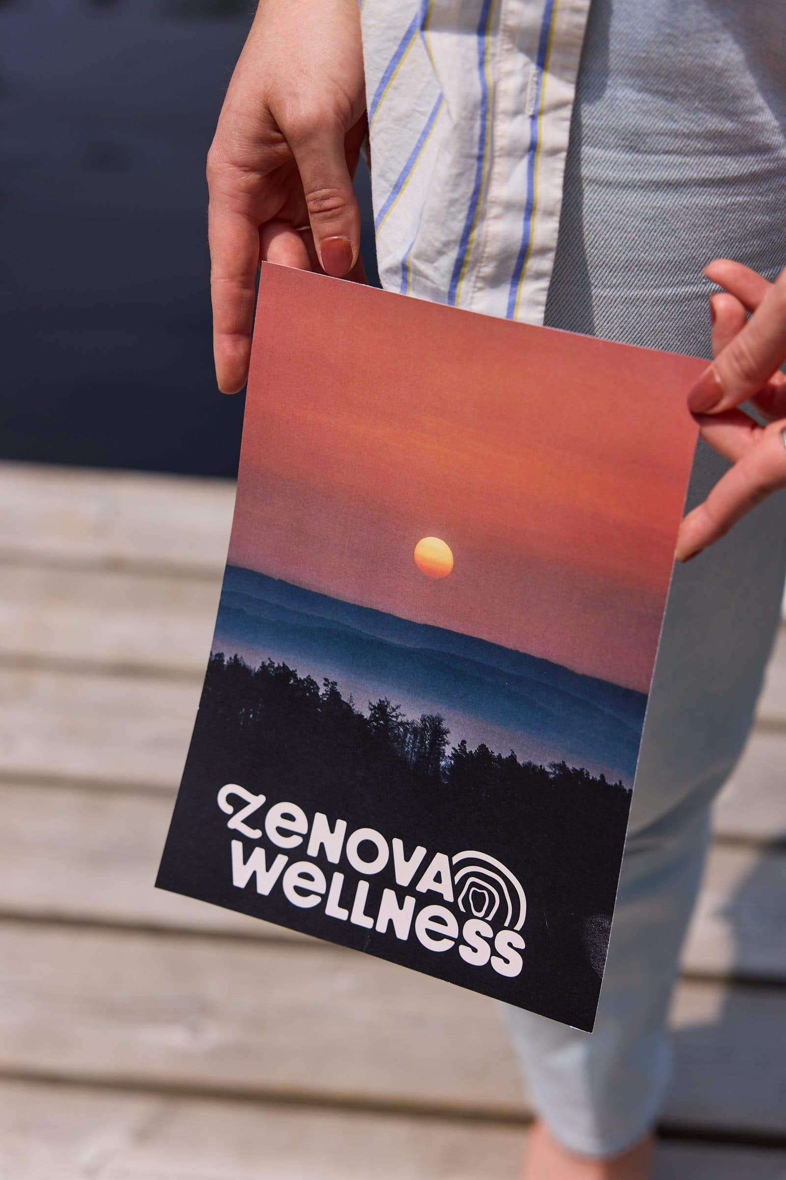
Zenova Wellness was created for a practitioner expanding beyond yoga into reflexology and a broader holistic wellness practice. The brand needed to feel unified enough for what she was launching now, while leaving room for a future studio or clinic. The work centered on creating one clear identity that could connect yoga, reflexology, and whole body wellness under a recognizable brand world.
Yoga and reflexology can easily feel like separate offers. Zenova needed a visual and verbal system that made the connection feel natural. The brand had to feel feminine, grounded, and trustworthy without becoming overly soft or generic. It needed to give the founder a clear identity her audience could recognize and grow with over time.
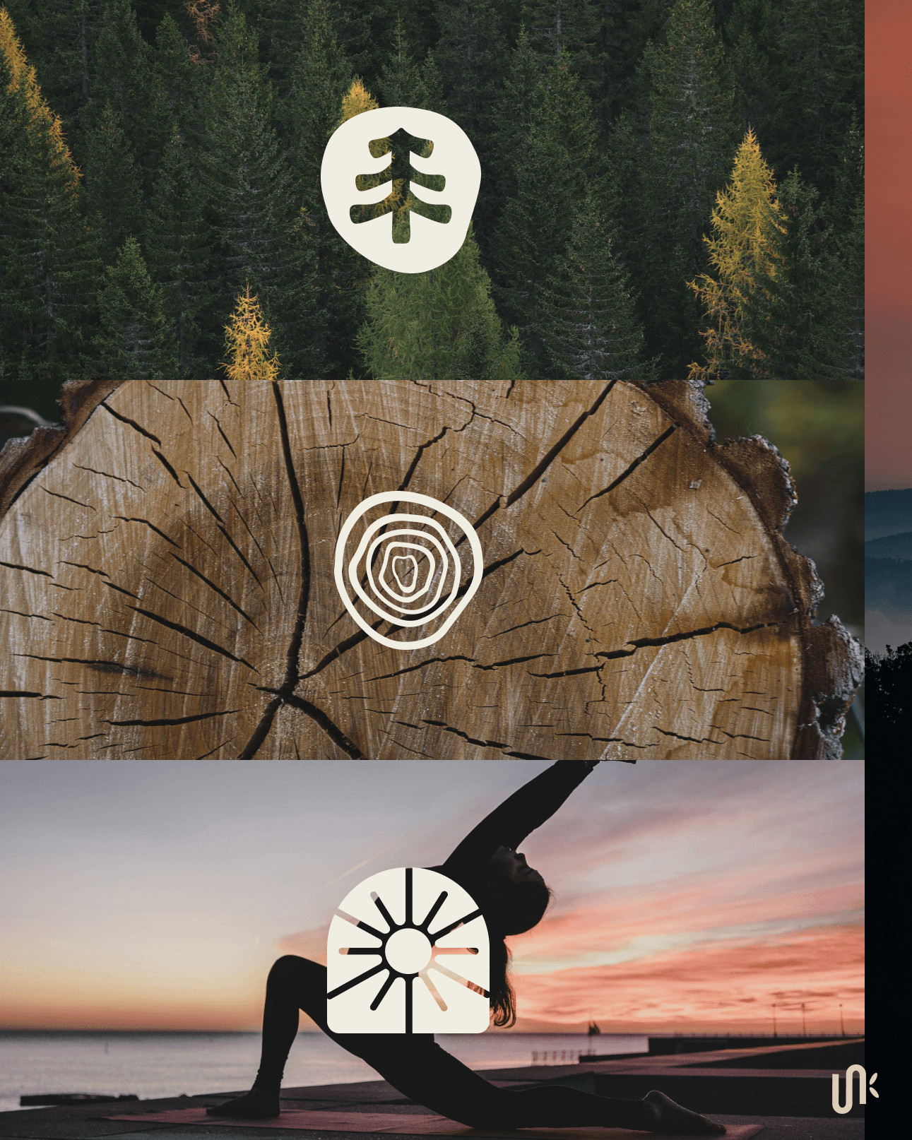
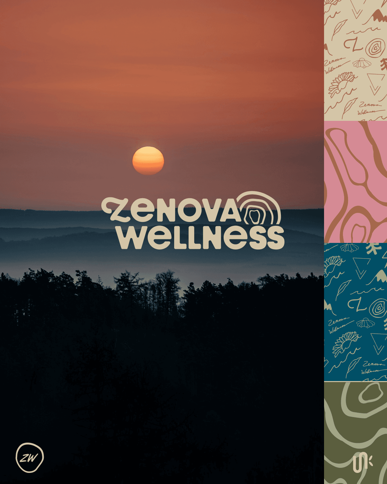
The visual direction was inspired by forests, rootedness, and the rings of a tree. Tree rings became a central symbol because they show time, layering, and growth from the inside out. That idea connected directly to the brand's focus on inner to outer wellness. Earthy color, organic icons, and nature inspired forms gave Zenova a calm and grounded brand world, while still leaving room for the practice to expand.
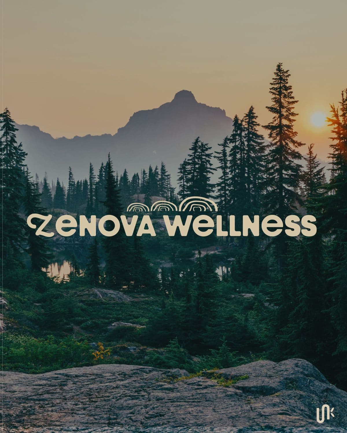
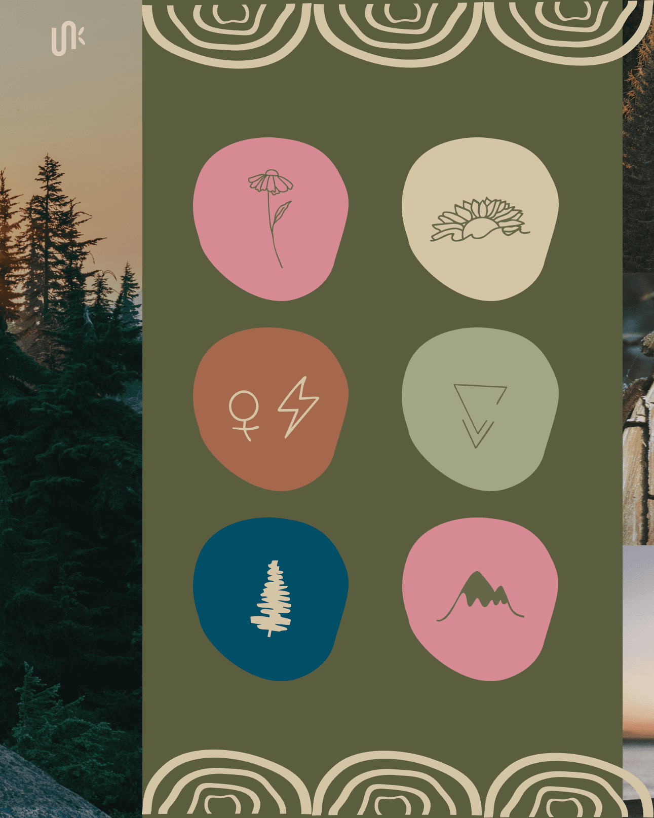
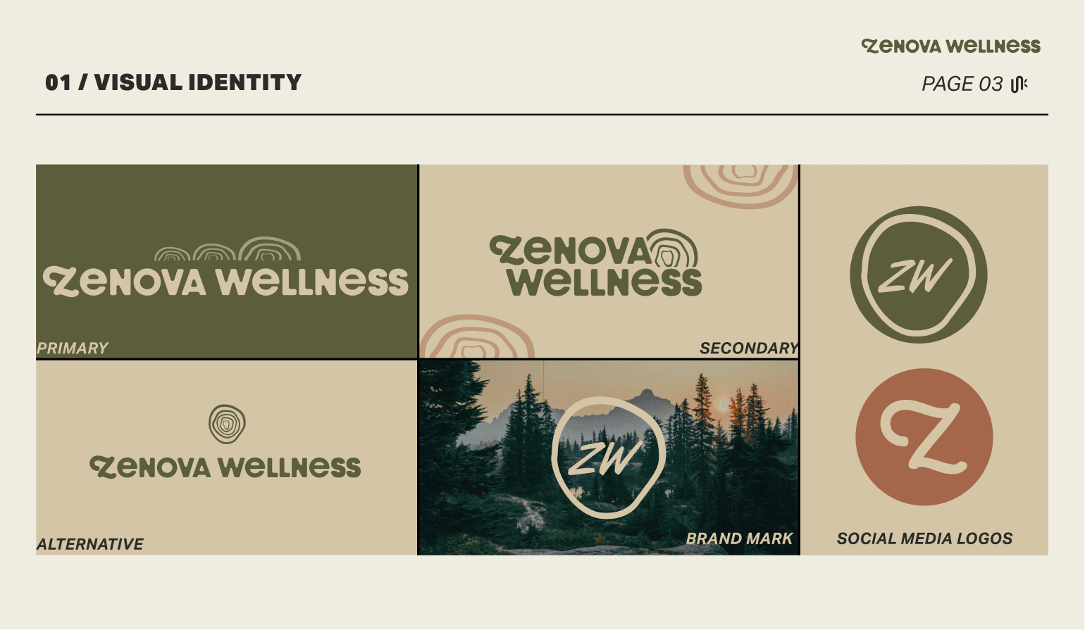
Zenova Wellness left with a cohesive identity that connected yoga, reflexology, and holistic wellness in one direction. The brand gave the founder a more established foundation to launch her reflexology practice and continue growing toward the studio or clinic she imagined.
Tell us what has changed and what is no longer working. We will tell you whether the project should begin with strategy, branding, or a full brand and website.