 Loading pageLoading pageLoading page
Visual Branding · Brand + Website · 2025
A therapy clinic rebrand and website built around trust and clearer service paths.
Clarity had grown into a clinic with multiple therapists and a wide range of services, but the brand still felt pieced together. The website was functional, the social presence existed, and the clinic was already doing meaningful work, but there was no clear visual or messaging system holding it together. The goal was to create a brand that felt professional, approachable, and grounded enough for a therapy setting without becoming generic or overly clinical.
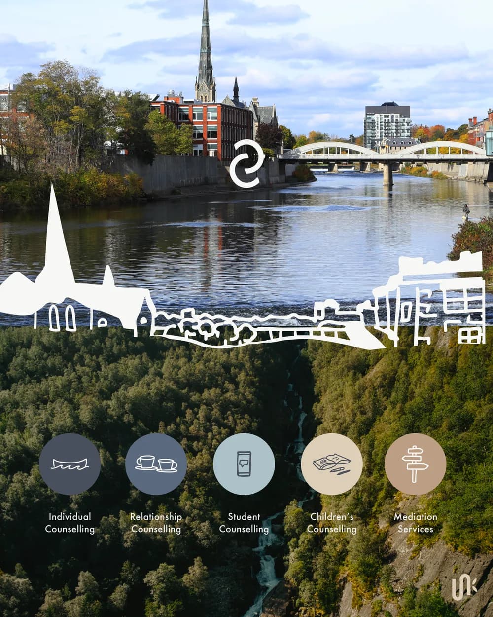
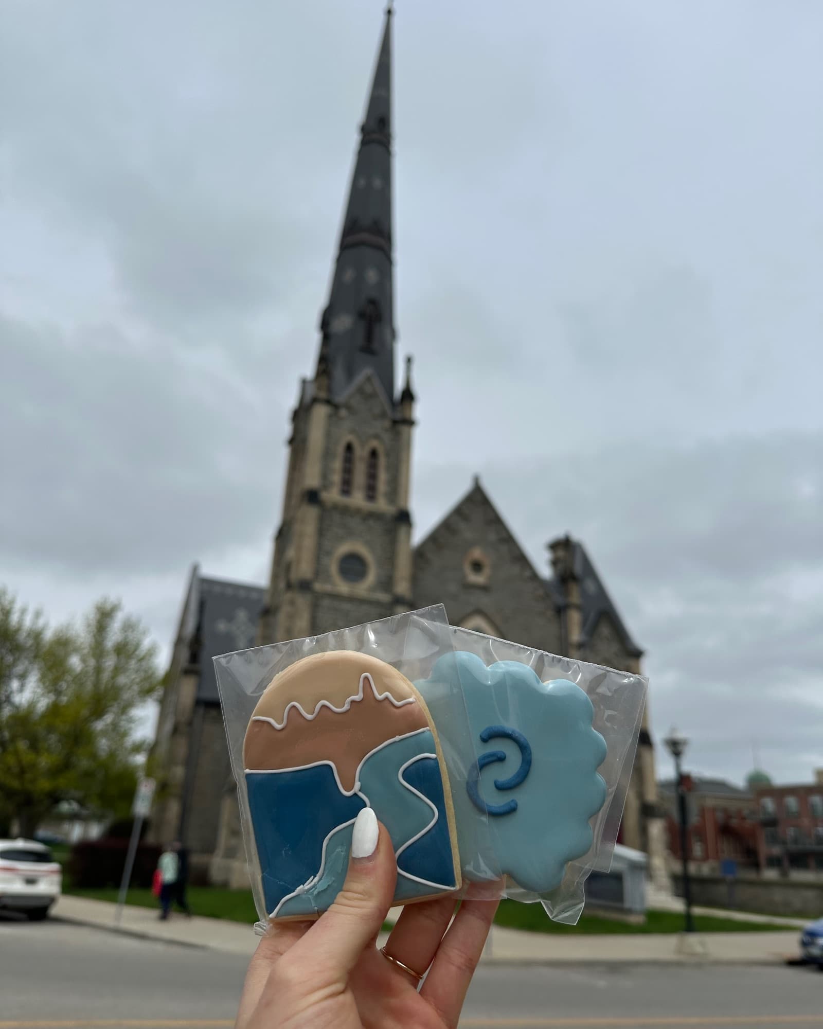
Clarity needed to build trust quickly. The brand had to speak to individuals, couples, students, families, and mediation clients while still feeling like one connected practice. Because the clinic is rooted in Galt, Cambridge, we used place as part of the strategy. The Grand River, local bridges, historic architecture, and hand drawn map elements became the foundation for a visual identity that felt personal to the community and meaningful to the work.
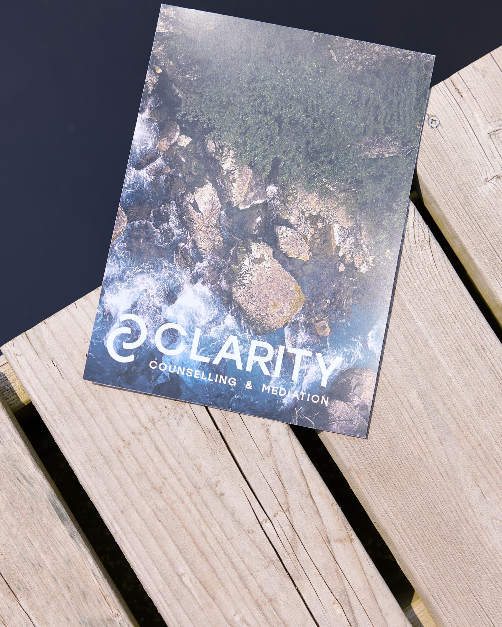
Water became the central metaphor. It gave the brand a sense of calm, movement, resilience, and guidance. Some parts of a river are steady. Some are harder to move through. That became a natural way to think about therapy and mediation without making the brand feel heavy. The blue palette supported trust and calm, while the custom icons and hand drawn local details gave the clinic a warmer, more human presence.
“Jaia Studio was amazing to work with from start to finish with our rebrand and new website launch. We love our new and improved website, and our clients love it too.”
Tell us what has changed and what is no longer working. We will tell you whether the project should begin with strategy, branding, or a full brand and website.