 Loading pageLoading pageLoading page
Visual Branding · 2025
A personal movement brand for Pilates, yoga, barre, and online training.
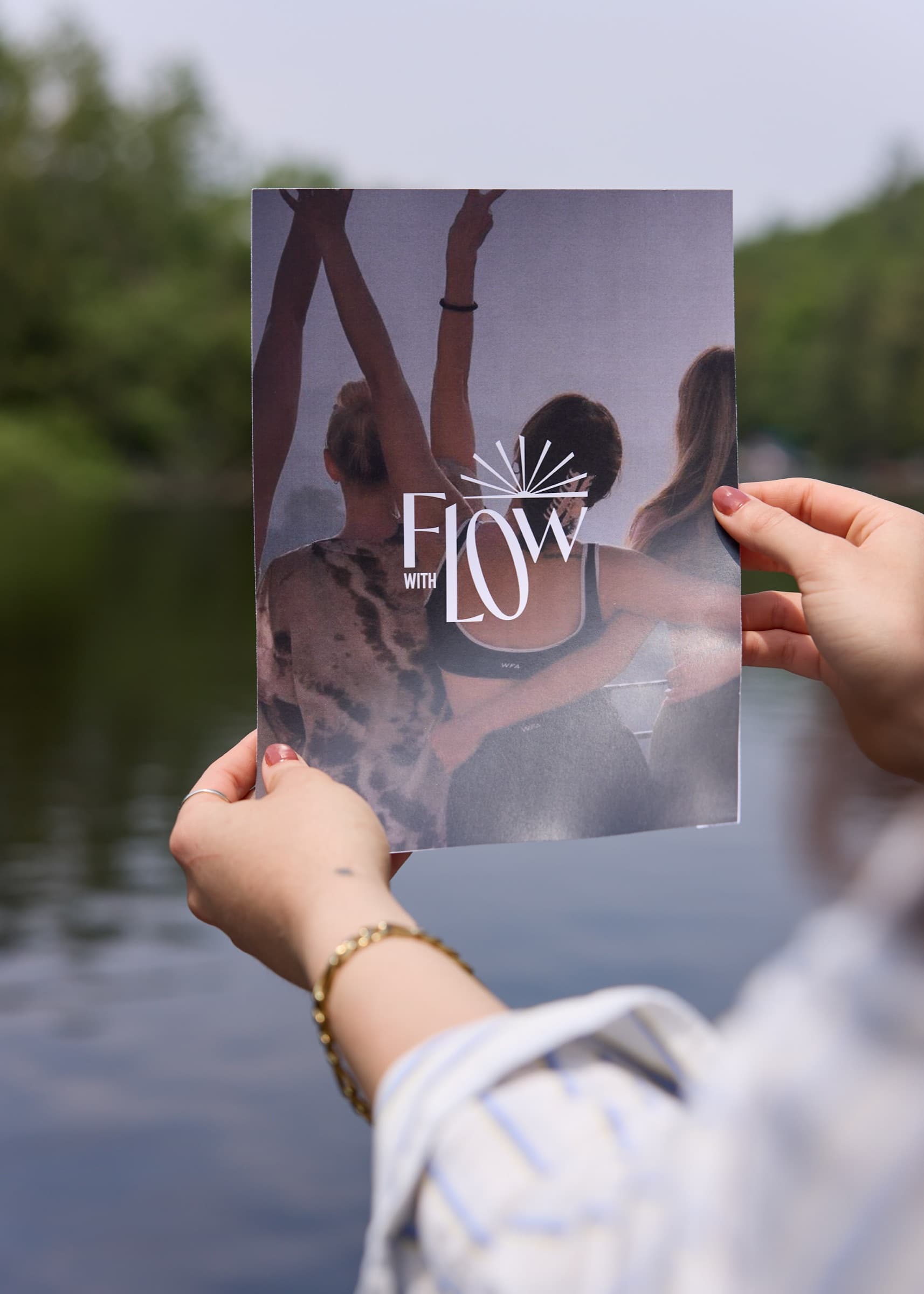
Lo had built trust through teaching and social media, but the brand around her work did not yet feel connected. She needed a visual system that could hold Pilates, yoga, barre, merchandise, and her online library without becoming generic wellness design.
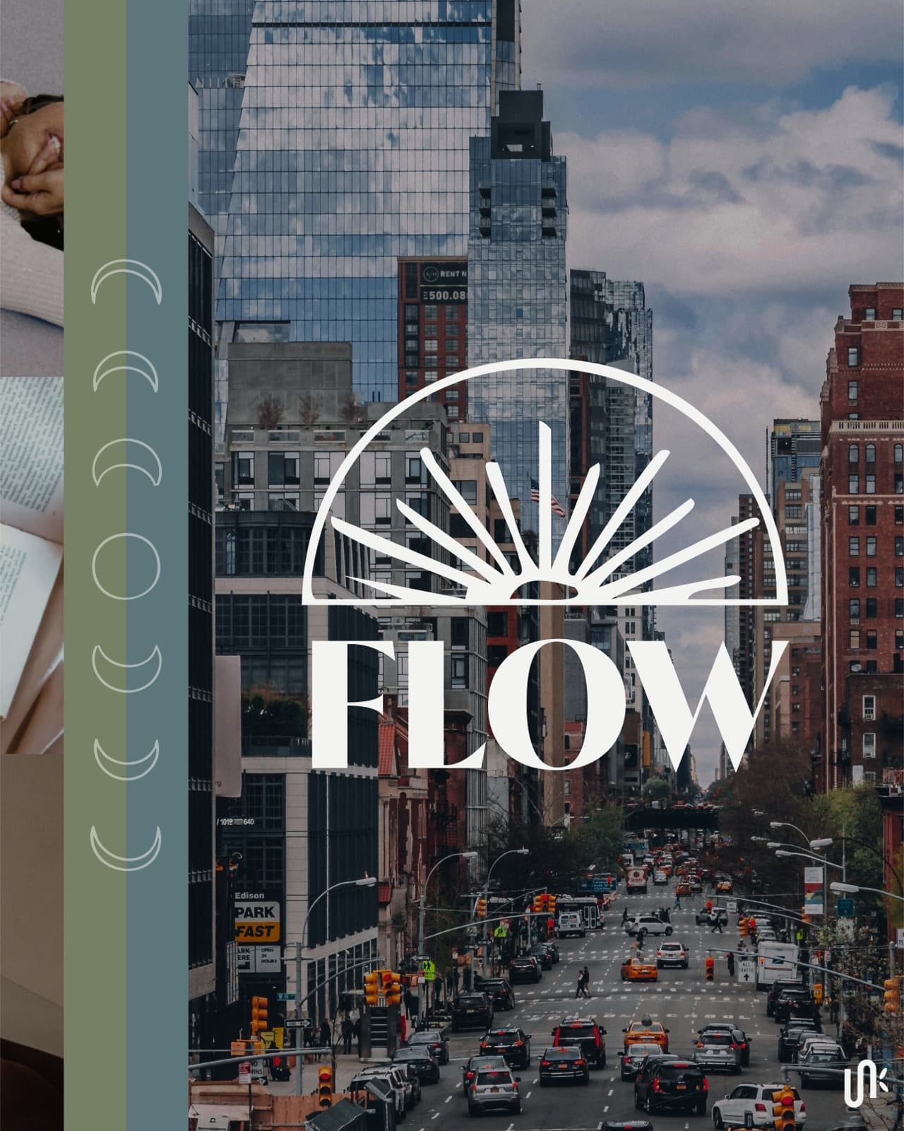
We built a brand that felt personal, city influenced, vintage, and movement led. The identity pulled from sun motifs, astrology, flow, and custom icons inspired by Lo’s own tattoos.
The new identity gave Lo a clearer system for launching merchandise, packaging her grip socks, and growing the Flow with Lo online library and in person courses.
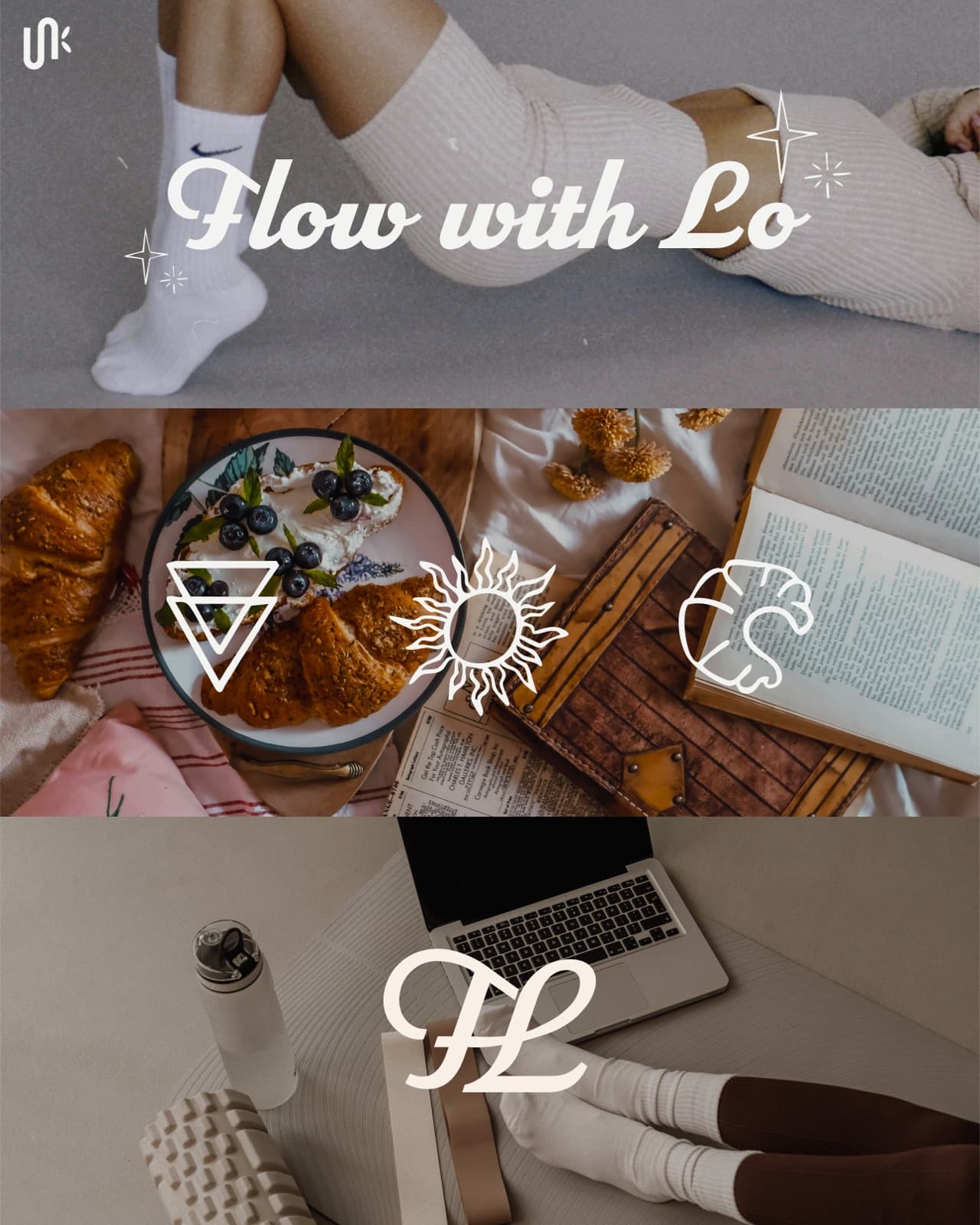
Lo was already an experienced instructor with more than a decade of teaching across Pilates, yoga, and barre. She had an engaged audience and a strong point of view, but the brand needed a more cohesive system to support the business she was building next.
The brand needed to feel like Lo. Not a generic beach retreat, not an overly polished wellness template, and not a fitness brand that could belong to anyone. It needed to feel approachable, personal, expressive, and flexible enough for classes, digital offers, and merchandise.
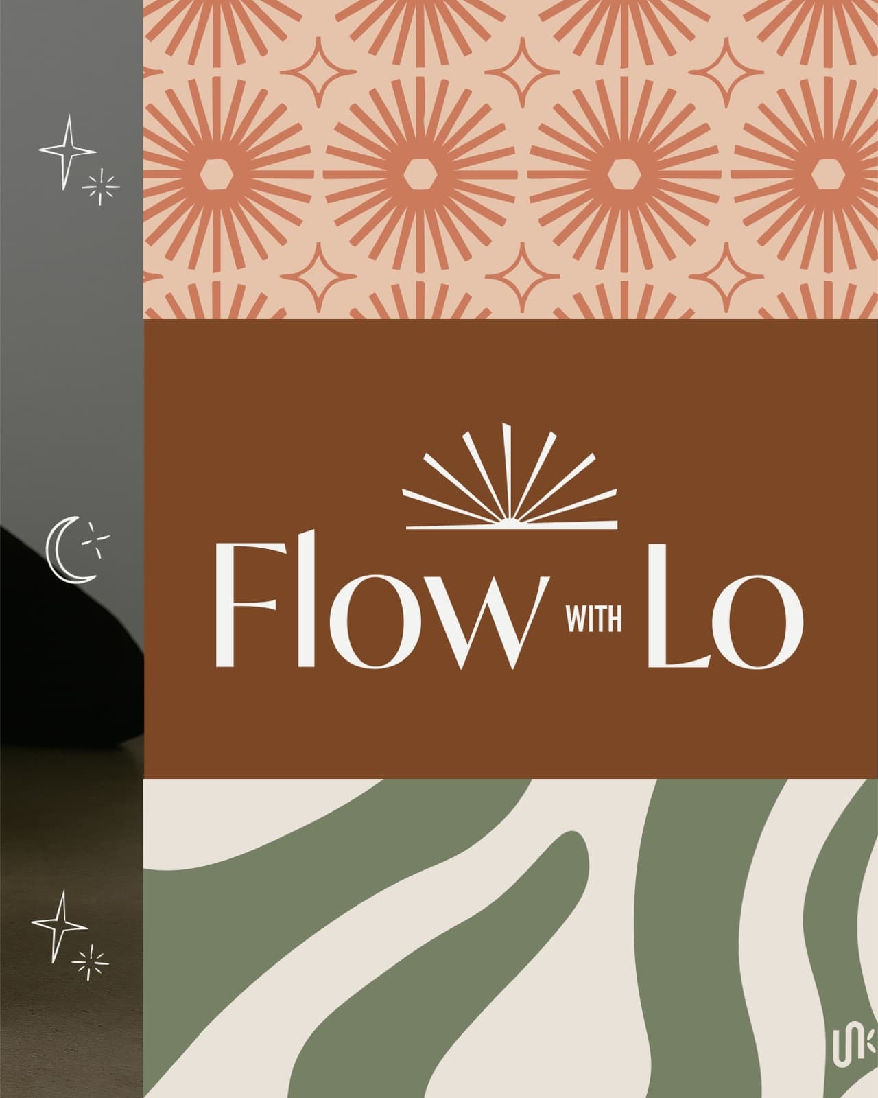
The visual direction blended city energy, vintage color, movement, sun symbolism, and subtle astrology references. Custom icons brought in personal details from Lo’s tattoos, giving the identity a more specific and recognizable world.
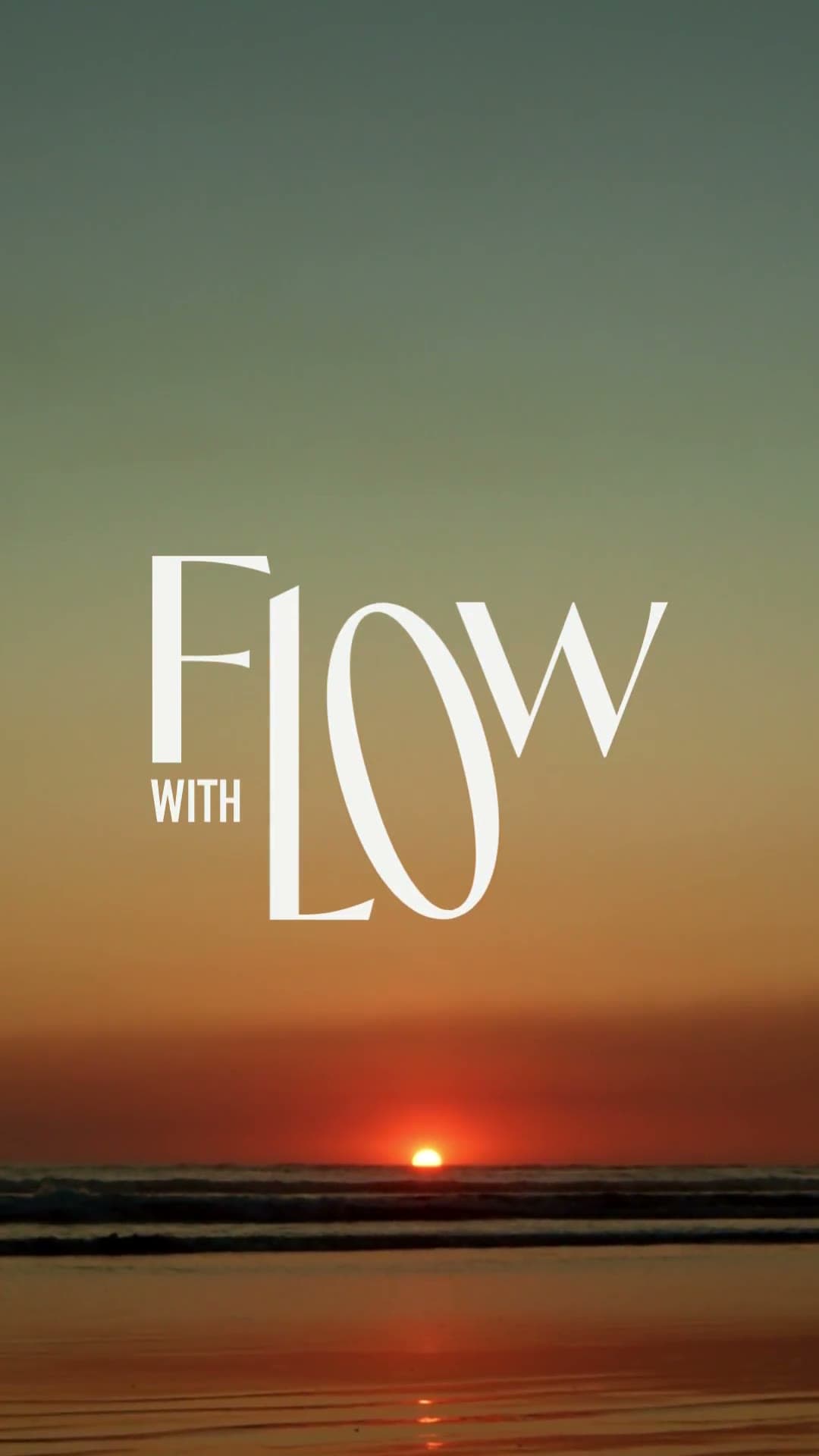
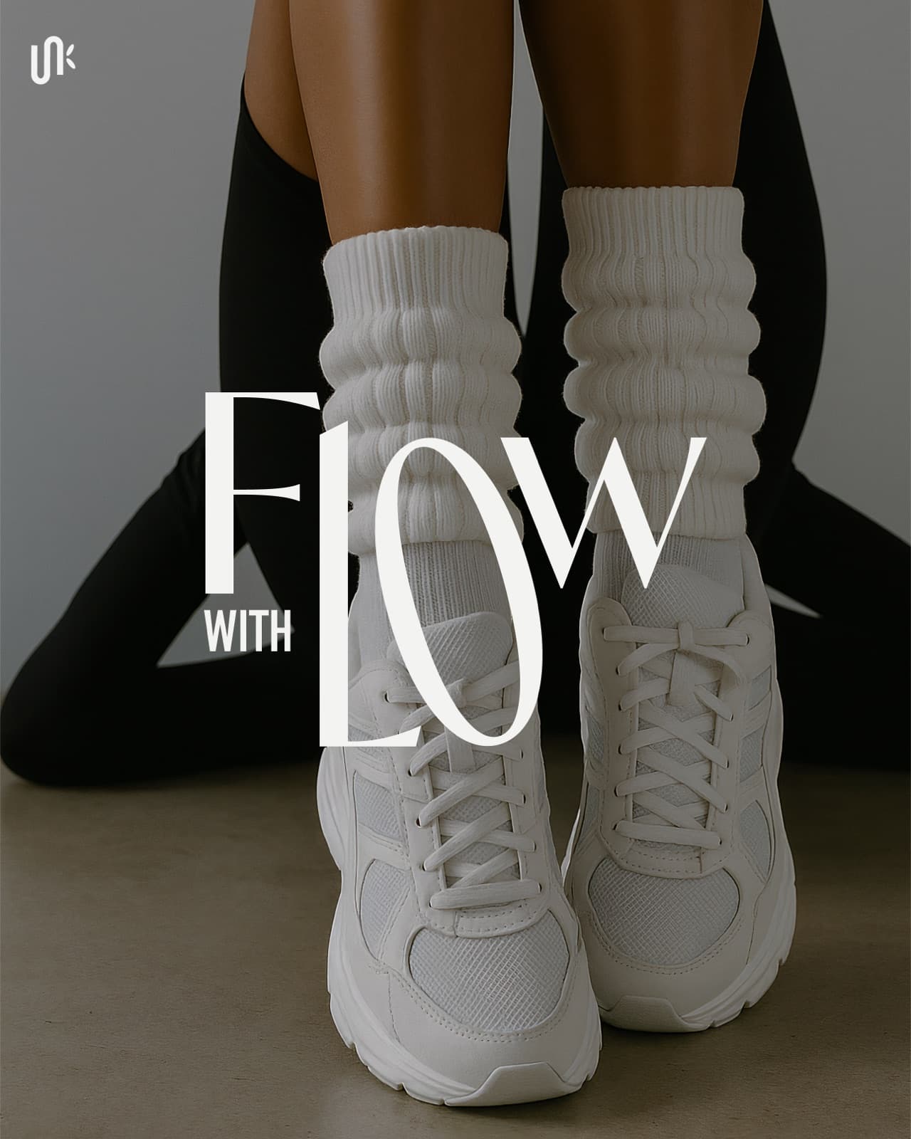
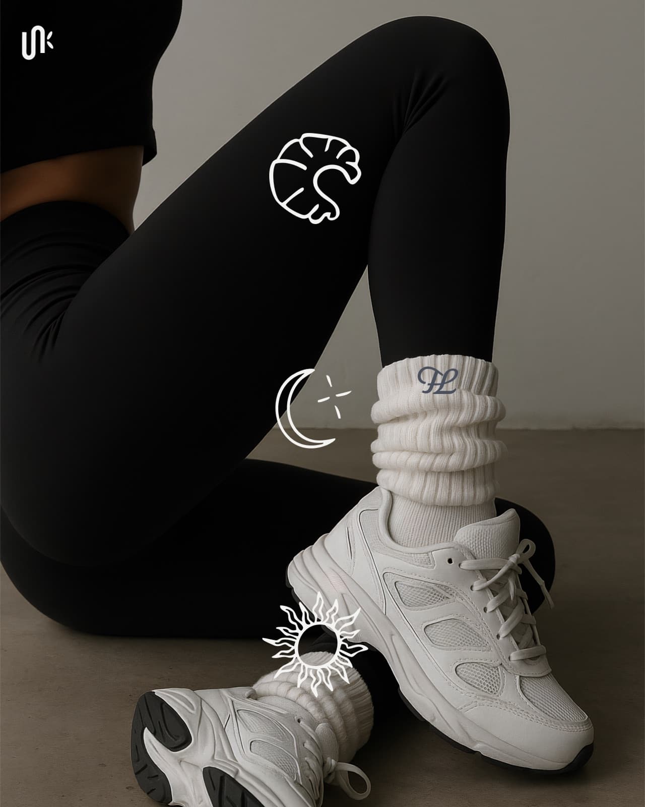
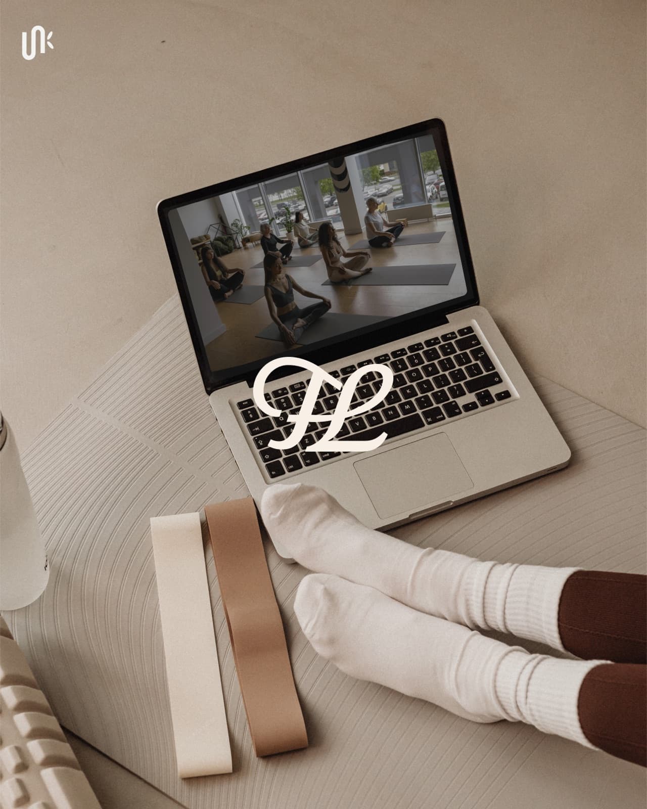
After the project, Lo brought the identity into her merchandise and launched branded grip socks while continuing to grow her online library and in person movement offers.
Explore Visual Branding for a brand system that can support your offers, content, and next stage.
Tell us what has changed and what is no longer working. We will tell you whether the project should begin with strategy, branding, or a full brand and website.