 Loading pageLoading pageLoading page
Visual Branding · 2025
Building a brand identity Rada Flow could grow into as a yoga instructor hosting classes and community events.
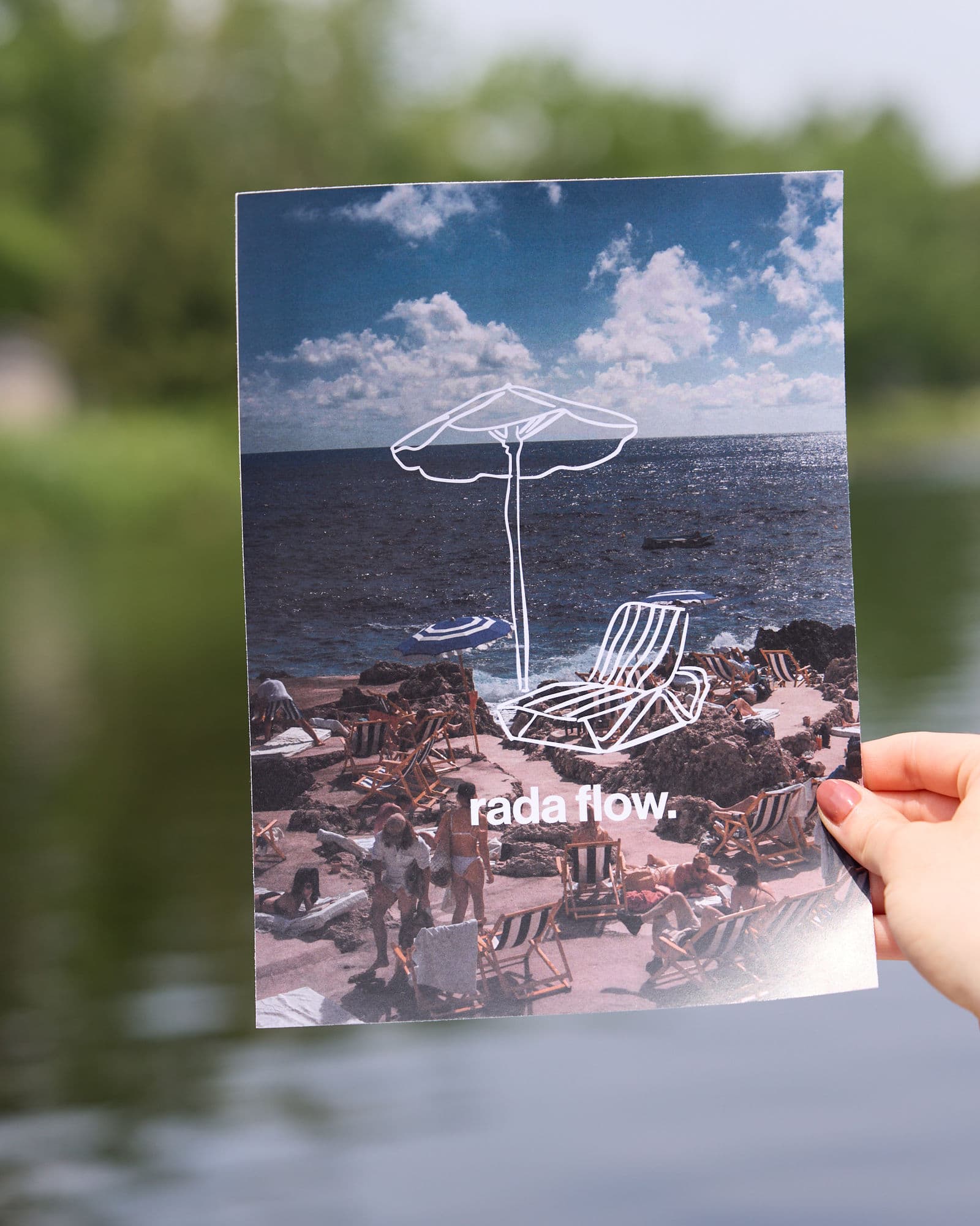
Rada had taught yoga locally for several years and wanted to create more opportunities under a recognizable personal brand. She had the name Rada Flow and a developing social presence, but no logo, colour palette, or visual system to connect the work. The goal was not to make an established business look different. It was to give Rada an identity that could support the classes, events, collaborations, and future experiences she wanted to create.
Rada was teaching part time and beginning to host more of her own experiences. Without a cohesive identity, it was difficult to present different classes and opportunities as part of one growing brand. She needed something personal enough to reflect her teaching style while remaining flexible enough for community events, new locations, a stronger local presence, and potential future retreats.
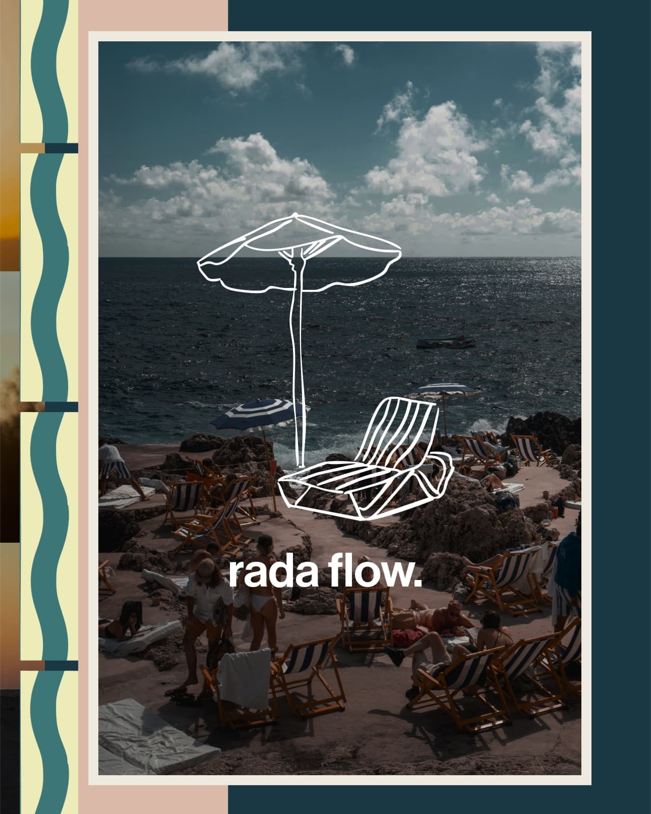
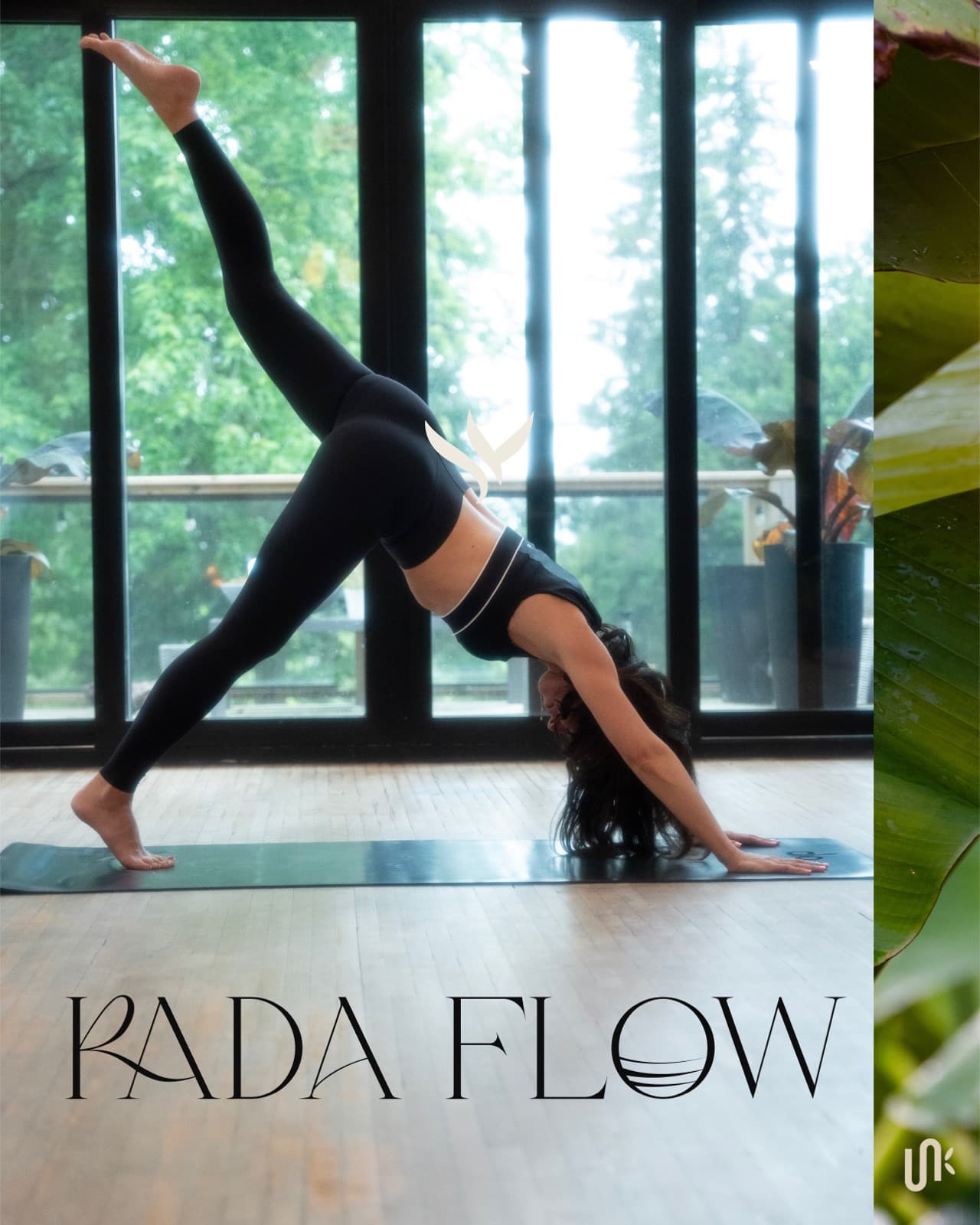
The visual direction brought together natural textures, travel inspired imagery, soft movement, and references to Rada’s Eastern European roots. The identity needed to feel transportive without becoming a generic travel or retreat brand.
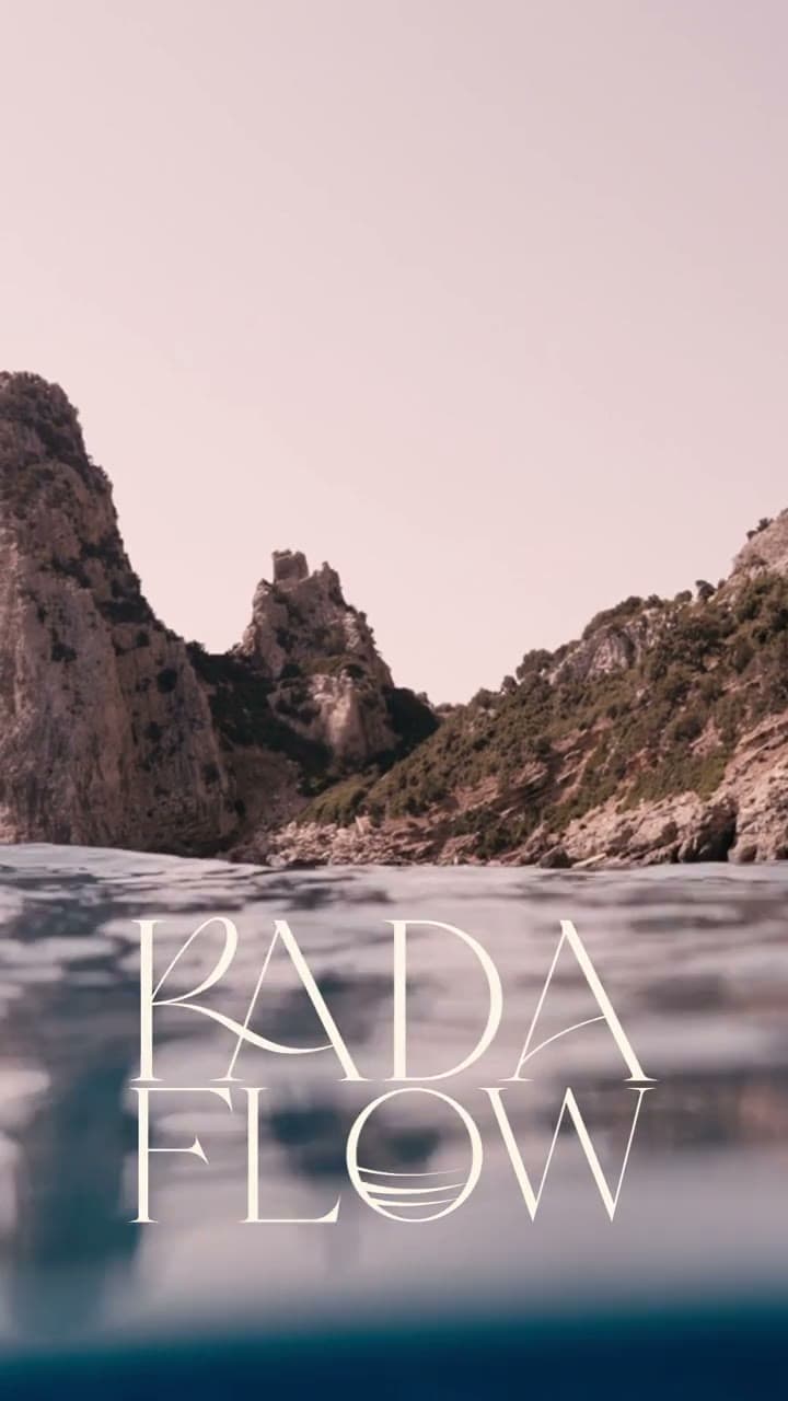
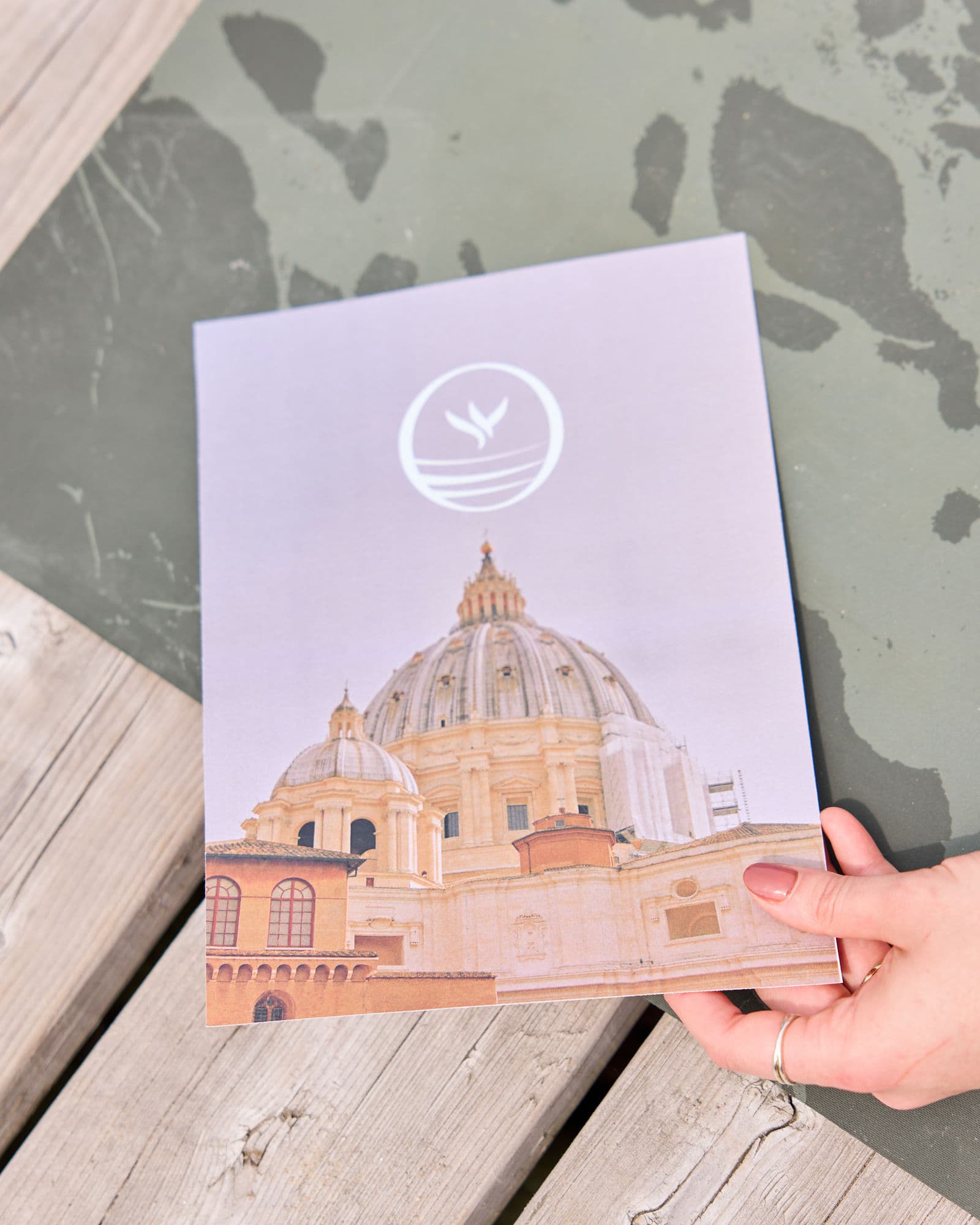
Rada’s interest in future retreats gave the brand a wider visual horizon. Coastal photography, natural colour, and custom marks created a sense of movement between places while keeping the identity grounded in her personal teaching practice.
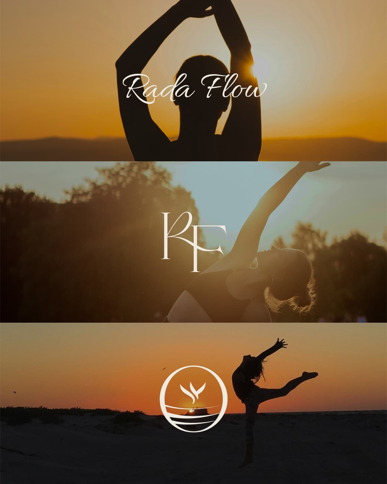
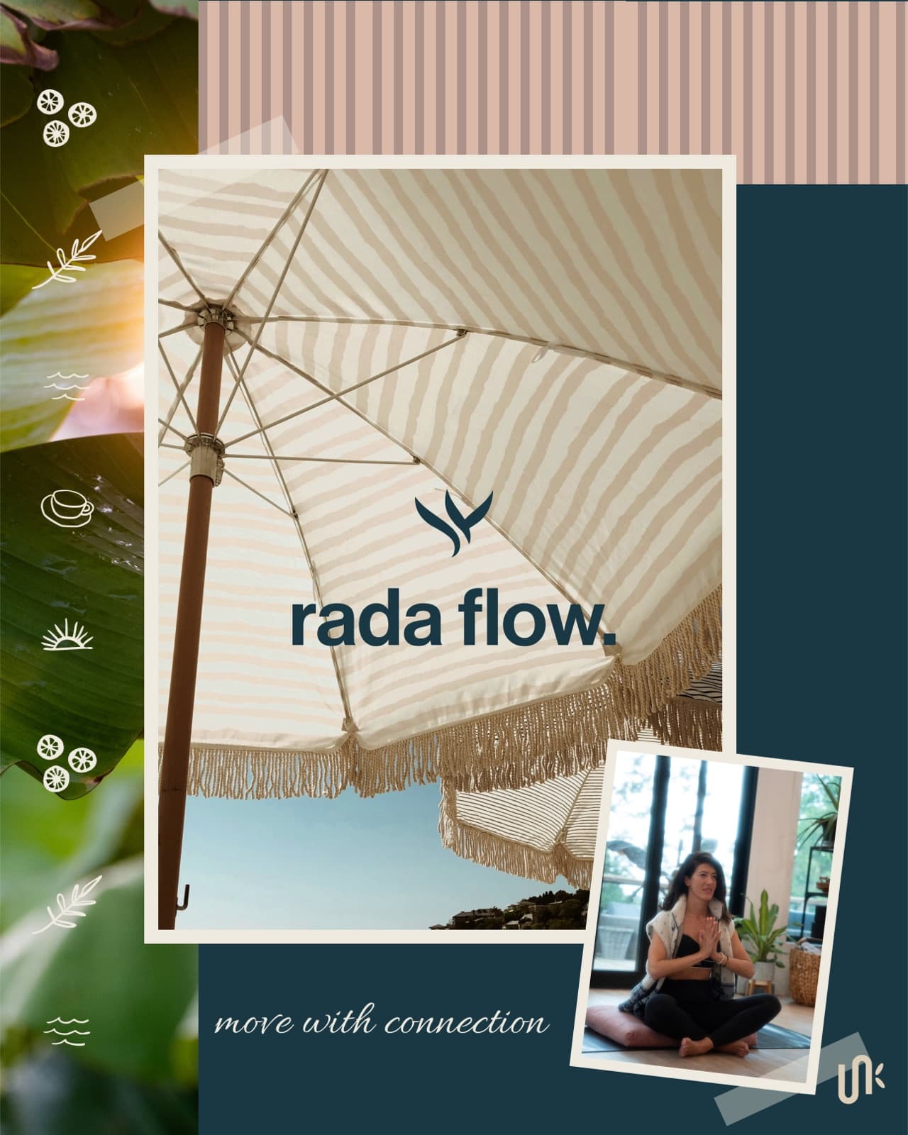
Rada was drawn to script typography but also needed a clear and usable primary identity. The logo system paired expressive script elements with a simple lowercase wordmark, supporting typography, an RF monogram, and a circular brand stamp.
The contrast gave Rada flexibility. The script could carry personality and movement, while the simpler marks could work across class graphics, events, social content, and future applications.
Custom illustrations, icons, patterns, and supporting marks gave Rada Flow a visual language beyond the primary logo. Natural colour and travel inspired imagery helped the brand feel grounded, personal, and open to new experiences.
The completed identity gave Rada a consistent way to present her teaching across social content, independent classes, curated events, and different local locations. It was flexible enough for the work she was doing immediately while leaving room for future retreats and broader wellness experiences.
Tell us what has changed and what is no longer working. We will tell you whether the project should begin with strategy, branding, or a full brand and website.