
Forge Fit
Visual Branding · 2024
Naming and branding for a personal trainer ready to grow into a real fitness business.
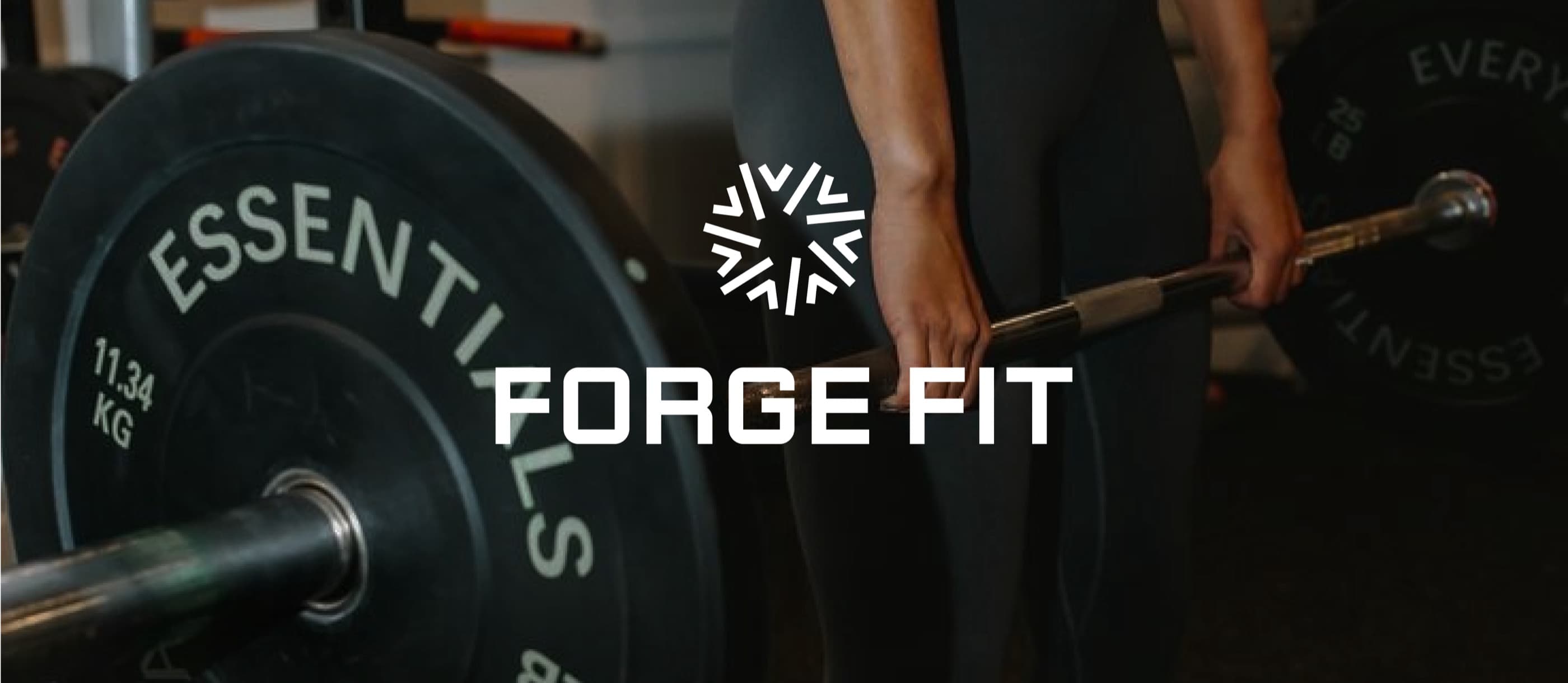
- Personal training and bodybuilding
- Naming, brand strategy, audience positioning, logo suite, visual identity, typography, colour, patterns, custom icons, marketing direction, and advertising design
- Kitchener, Ontario
Build a fitness brand with room to grow beyond one person.
Aleesha was already working as a personal trainer and bodybuilder under the name AMF Fitness. She had built recognition in the fitness community, but the name and visual identity were still closely connected to her personal presence. To move into fitness full time, she needed a business brand that could attract clients and grow beyond her.
A personal name could only carry the business so far.
Aleesha wanted to work with men and women across different experience levels while developing a stronger specialization in bodybuilding. AMF Fitness did not clearly communicate the intensity, discipline, or long term direction of the business. The brand also needed room for future trainers, a larger team, or a physical studio without making every part of the business dependent on Aleesha’s personal name.
Serious about strength without excluding beginners.
Forge Fit was positioned for men and women ranging from beginners to advanced clients. The brand needed enough intensity to support bodybuilding and performance goals while remaining accessible to people beginning their strength journey. The shared idea was progress through consistent work. Clients did not need to begin as bodybuilders, but they did need to be ready to take action and build.
From AMF Fitness to Forge Fit.
Jaia Studio recommended moving away from a name connected to Aleesha personally. Forge Fit created room for the business to expand while reflecting the physical and mental process behind strength. To forge something is to shape it through heat, pressure, and repeated effort. The name captured Aleesha’s approach to training and the kind of progress she wanted clients to experience.
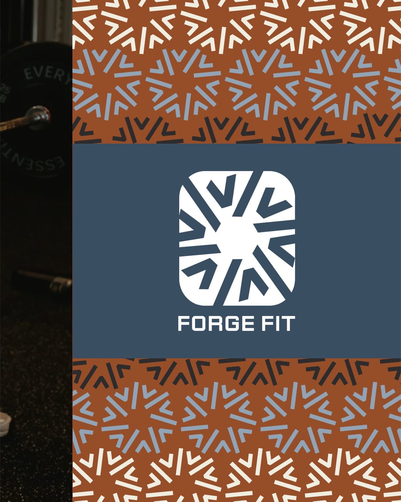
A visual system built around effort and momentum.
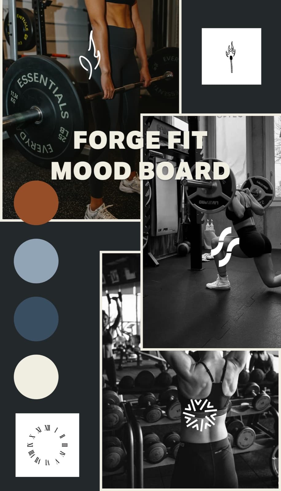
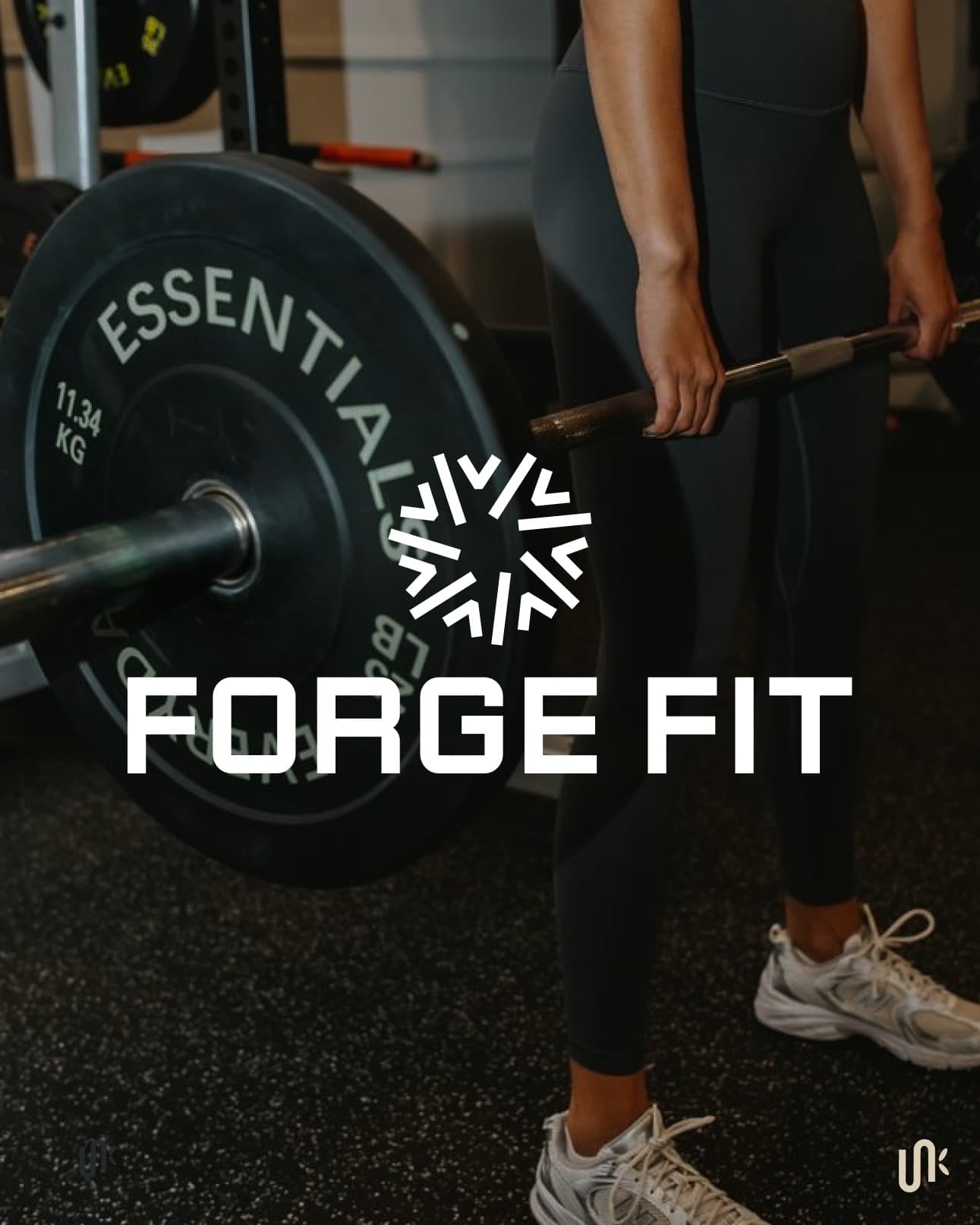
Gears and circular movement became a central part of the identity. The imagery reflects multiple parts working together, repeated action, and momentum created over time.
Roman numerals I and V reinforce the time invested in doing the work and the idea that the time for action is now. Rust and copper tones reference embers and heat, while cooler blues balance the palette and make the system flexible across audiences.
- Complete logo suite
- Typography system
- Colour palette
- Patterns
- Custom icons
- Brand marks
- Marketing direction
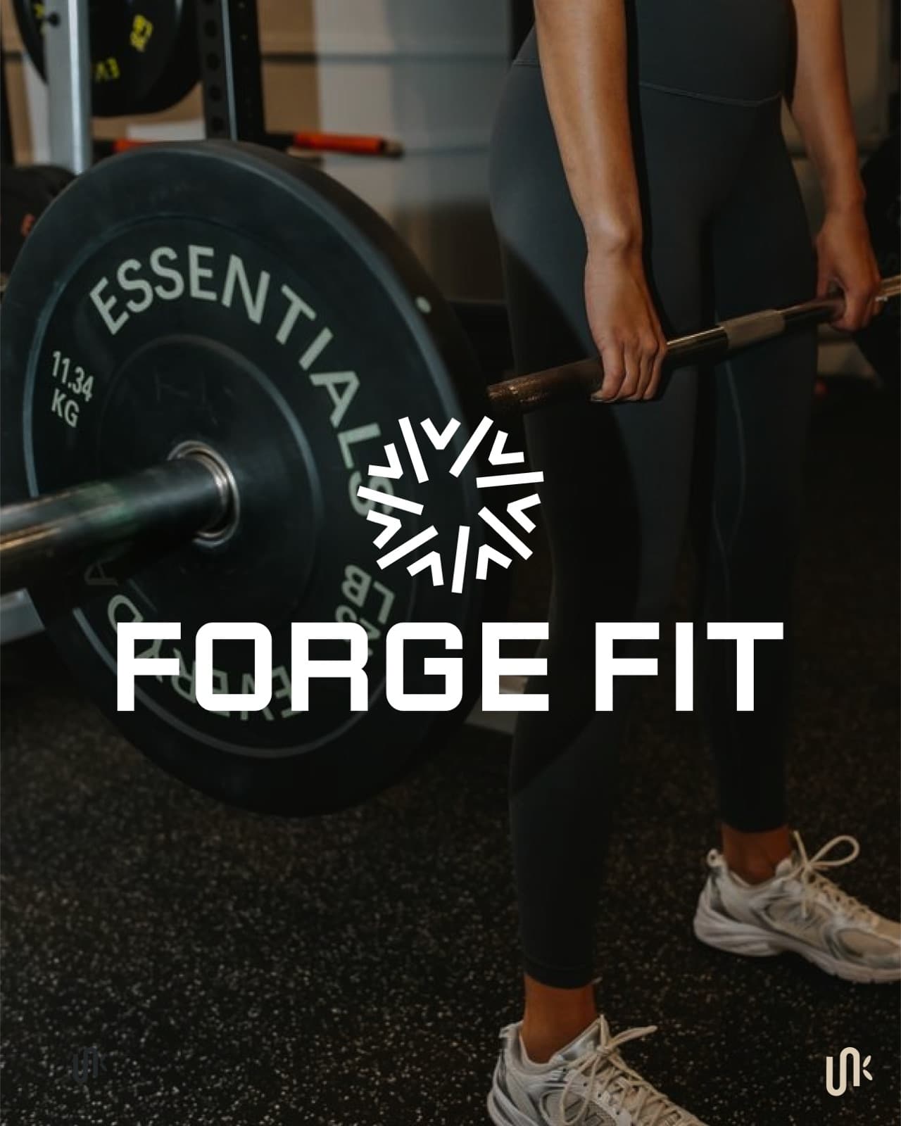
An identity that could move from training to marketing.
The completed system gave Aleesha a consistent way to present personal training, bodybuilding, advertising, and future offers. It was strong enough for performance focused work while remaining flexible for beginners and a broader client base.
After launch, Jaia Studio also helped design advertisements. Aleesha used the visual identity to create her own branded merchandise.
Identity in motion.

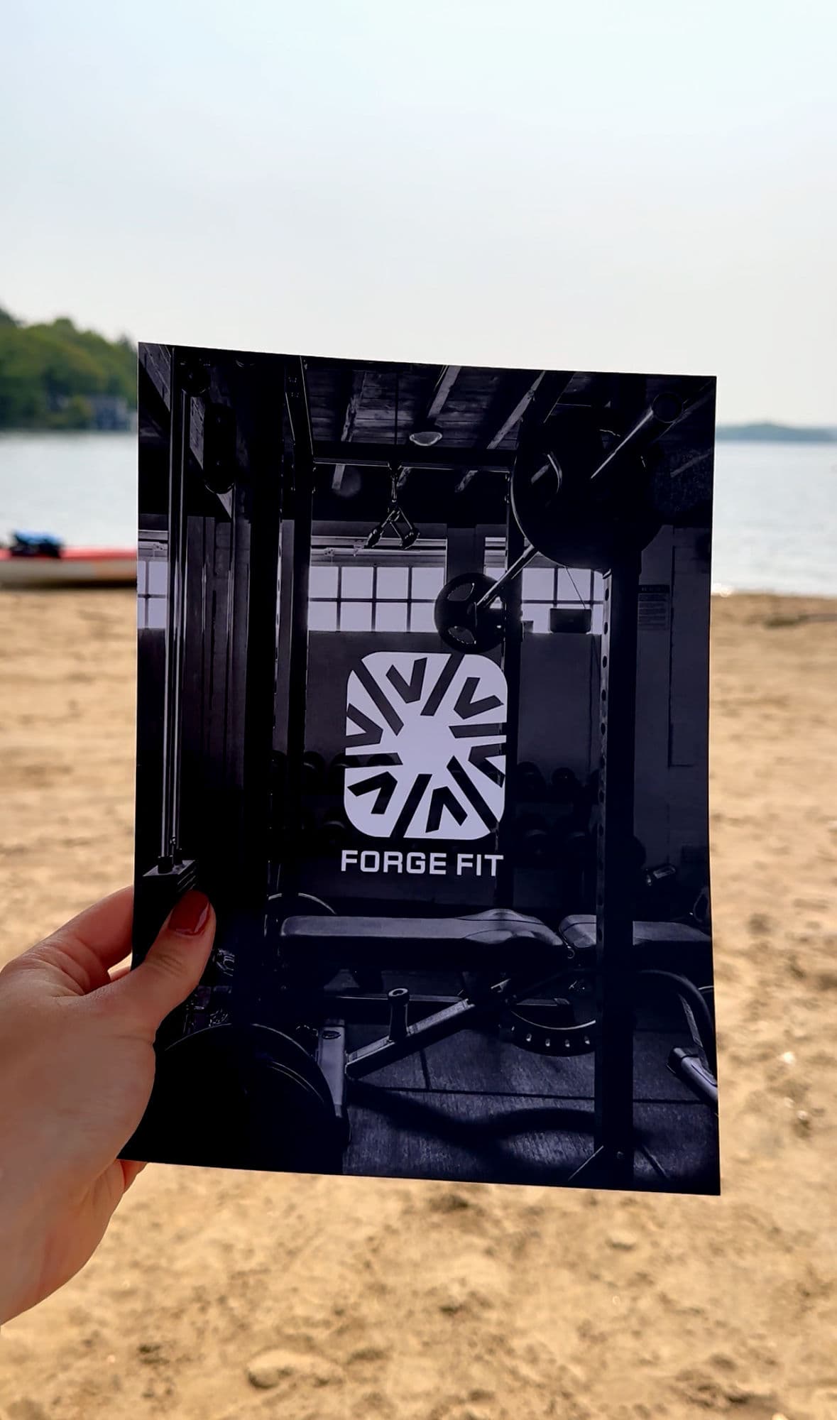
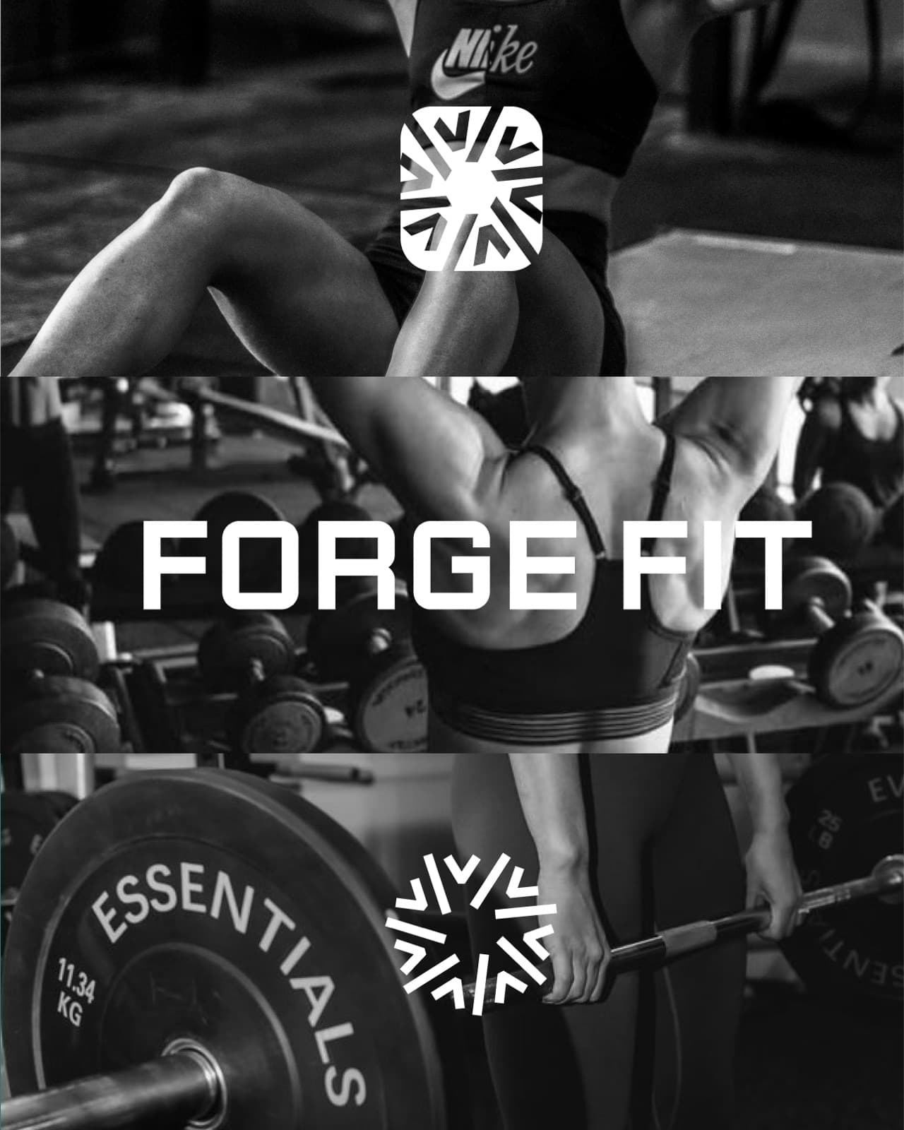
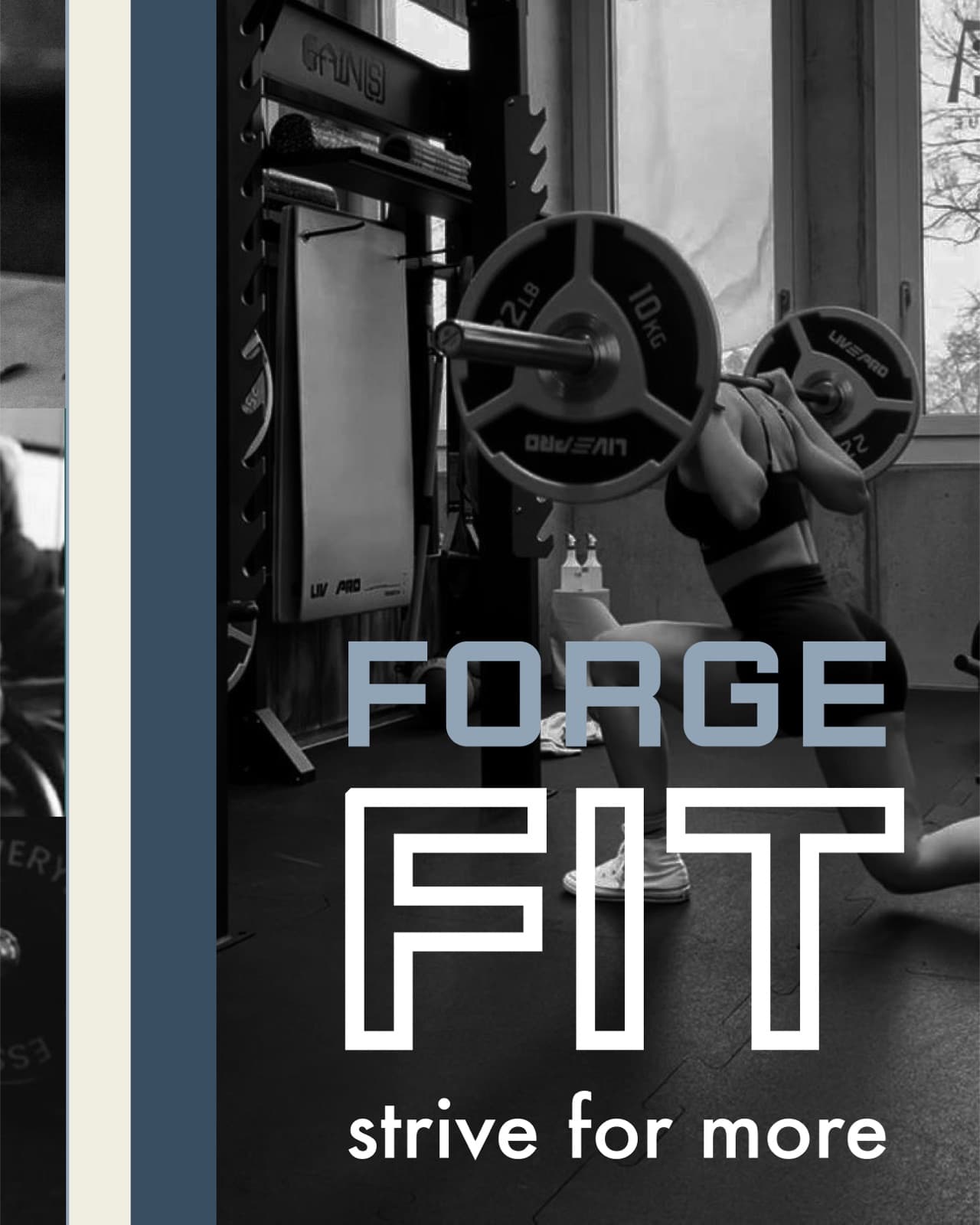
A brand that helped Aleesha step into fitness full time.
- Aleesha launched Forge Fit with a stronger name, clear positioning, and a complete visual identity.
- After launch, she began attracting and signing personal training clients while continuing to build recognition as both a trainer and bodybuilder.
- As the business grew, Aleesha was able to leave her previous full time job and move into fitness full time.
- The identity gave her a consistent system for marketing, advertising, future growth, and branded merchandise.
“Jen has been instrumental in not only building my personal training brand and identity, but in giving me the confidence to launch and effectively market my business.”
Let us make the brand match the business.
Tell us what you'd like to create or improve. We'll recommend Visual Branding, Brand + Website or AI Strategy Sessions based on what you need.