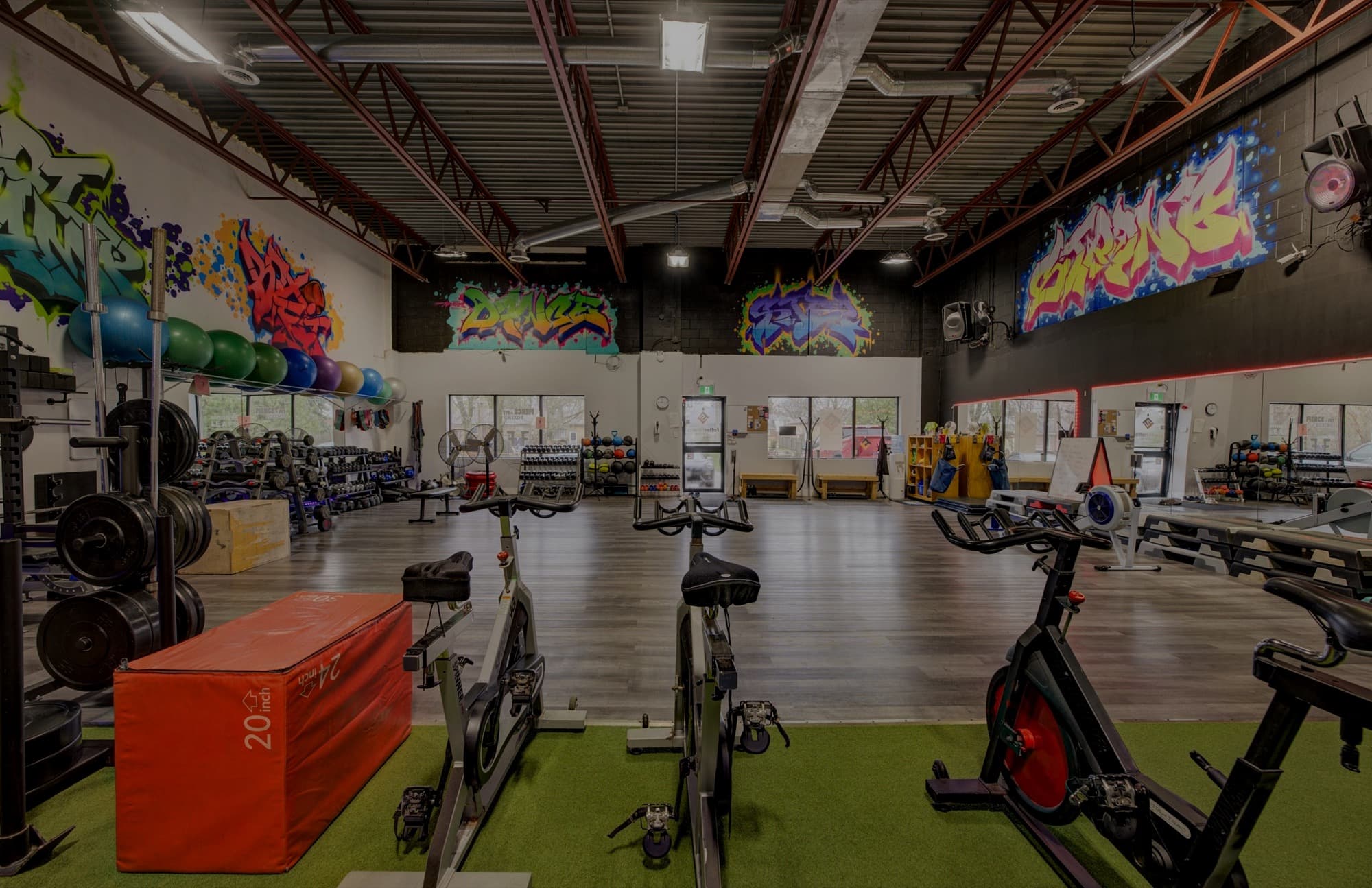
Fetter Fitness had changed. Its website had not.
What began as a single trainer brand had grown into a private gym with three distinct ways people used the space. The business was more layered, more bookable, and more valuable than the site still suggested.
That gap is more common than most fitness founders admit. The offers evolve. The schedule fills. The brand matures. Meanwhile the website keeps describing an earlier version of the business, and visitors leave without knowing where they belong.
This is the story of how Fetter Fitness closed that gap.
What Fetter Fitness had become
By the time of the rebuild, Fetter Fitness was no longer just a personal training brand. It was a private gym supporting three revenue paths:
- Memberships for clients who wanted consistent access and training inside the space
- Trainer rentals for independent coaches who needed a professional environment to work with their own clients
- Content bookings for creators and brands who wanted to use the gym as a setting
Those are three different buyers, with three different questions, arriving through the same front door.
A potential member wants to know what training feels like, what membership includes, and how to start. An independent trainer wants to understand rental access, logistics, and whether the space is worth bringing clients into. A creator wants to know if the gym photographs well, books cleanly, and fits the shoot.
If a website treats all of that as one vague “services” pile, every visitor has to work harder than they should.
The problem was not a lack of offers
Fetter Fitness already had strong offers. The issue was structure.
When memberships, trainer rentals, and content bookings compete for attention on the same pages, the business becomes harder to understand than it needs to be. Strong offers start looking like clutter. Clear paths start looking like options. And options, without hierarchy, rarely convert.
The website needed to do more than list what Fetter Fitness offered. It needed to help each visitor recognize themselves quickly and move toward the right next step.
That is a website strategy problem before it is a design problem.
Rebuild the site around how people choose
Jaia Studio rebuilt the Fetter Fitness website around the three reasons people came to the gym.
Instead of asking every visitor to sort the business out for themselves, the structure made the paths visible:
- members could find membership without wading through rental language
- trainers could evaluate the space without getting lost in client-facing membership copy
- content bookings had a clear place instead of feeling like an afterthought
The project included website strategy, brand expansion, user experience and interface design, website copywriting, website development, and custom photography. The expanded visual system and photography helped the gym feel consistent page to page. The sharper structure did the heavier commercial work.
When a fitness business has more than one buyer, the homepage cannot try to say everything to everyone. It has to orient people first, then deepen the path that matches why they showed up.
What changed after launch
After launch, Fetter Fitness saw increased website traffic, bookings, and interest from trainers. The gym was fully booked within one month.
That result did not come from adding more information. It came from organizing the business around decisions visitors were already trying to make.
A clearer website does not invent demand. It removes friction between the demand that already exists and the offer that already works.
The lesson for fitness businesses that have outgrown their site
If your business has expanded but your website still speaks to an earlier stage, the next step may not be another page, another font, or another round of “we just need better photos.”
It may be a clearer structure.
Ask:
- Who are the distinct buyers arriving at this site?
- What does each one need to understand before they can act?
- Where does the current site force those paths to compete?
- What would change if each path had its own clear route?
Fetter Fitness did not need a louder website. It needed a website that matched the business it had already become.
When the site finally did that work, the business became easier to understand, easier to book, and easier for the right people to say yes to.
Explore Brand + Website if your business has outgrown the structure of its current site, or see the Ivie Athletica case study for another fitness brand built around clearer growth.