Simple logos are the hardest to design.
For Pickled Pilates, I tested close to 1,000 variations before the final mark worked.
Because this wasn’t just a pickleball brand.
It was a hybrid fitness studio concept combining:
• Pickleball courts
• Pilates reformer classes
• A health café serving kombucha
• Community events and branded merchandise
The logo couldn’t just “look sporty.”
It had to unify an entire wellness ecosystem.
This is a case study in strategic fitness studio branding and why strong brand identity starts with structure, not aesthetics.
The Branding Challenge: A Hybrid Wellness Concept
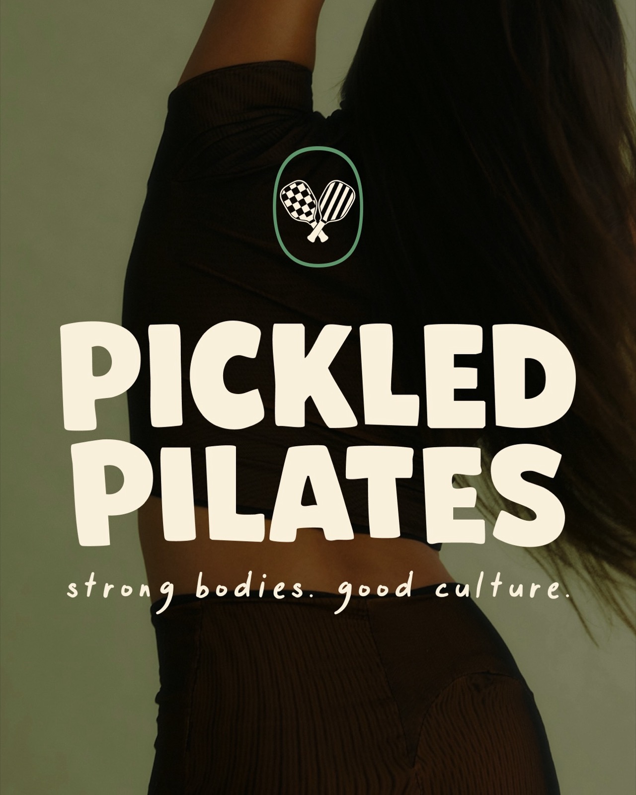
Pickled Pilates was developed as a boutique fitness brand concept a modern club that sits at the intersection of:
• Sport culture
• Strength training
• Social wellness
From a branding perspective, this creates tension.
If the identity leaned too heavily into pickleball, it ignored Pilates.
If it focused too much on wellness,* it lost sport credibility.*
If it felt like a local juice bar, it weakened the premium club positioning.
The brand identity needed to communicate all three pillars clearly and cohesively.
That’s where most fitness branding falls apart.
When positioning isn’t locked in, the logo becomes confused.
The Wrong Direction: Literal Design
Initially, I kept forcing the two P’s into paddle shapes.
It felt obvious.
Two paddles. Two P’s. Cross them?
But it looked expected. And flat.
Like a gym that added pickleball as an afterthought.
That’s the difference between logo design and brand identity design.
Literal doesn’t always mean strategic.
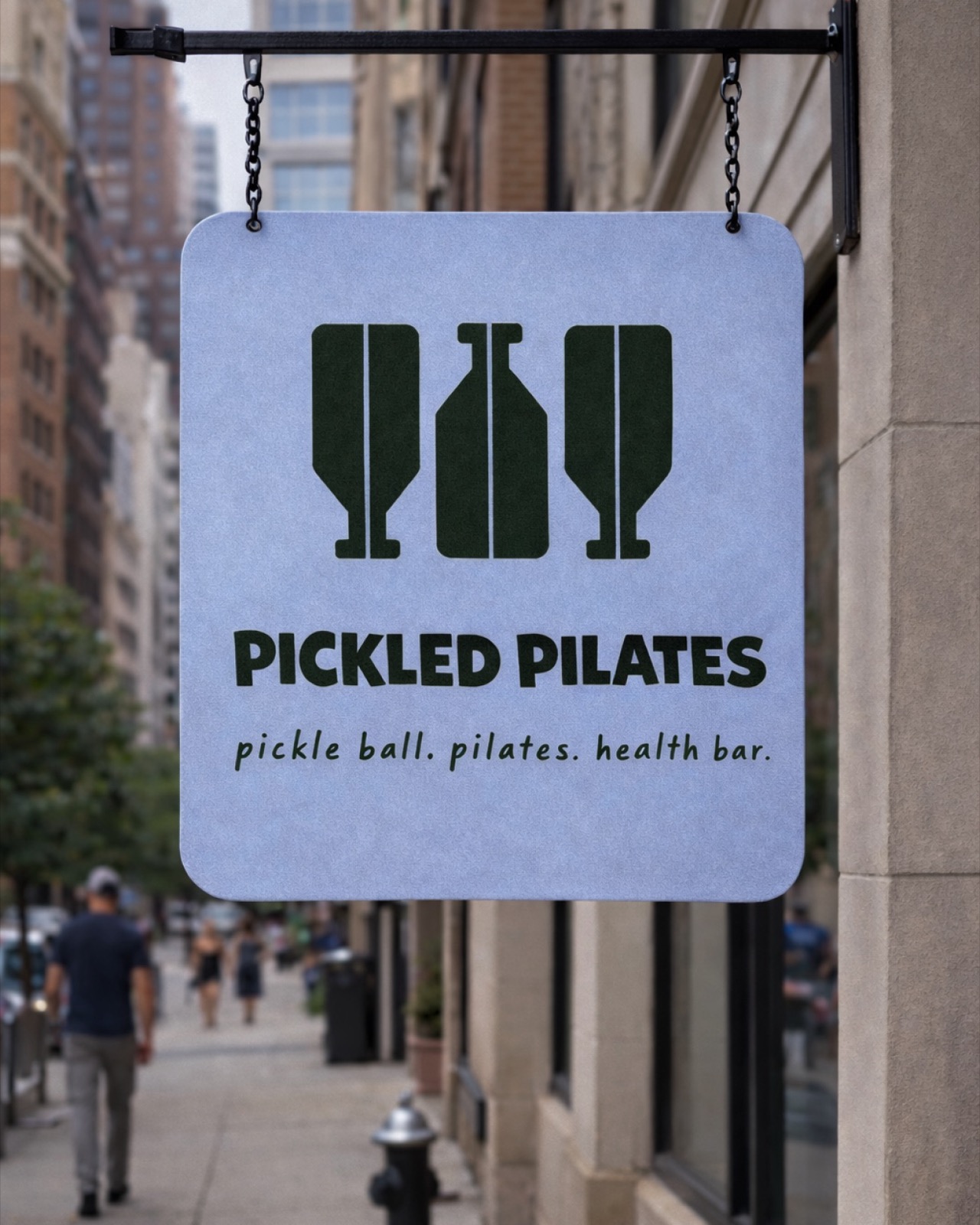
The Breakthrough: One Shape, Multiple Meanings
The turning point came when I stopped designing paddles.
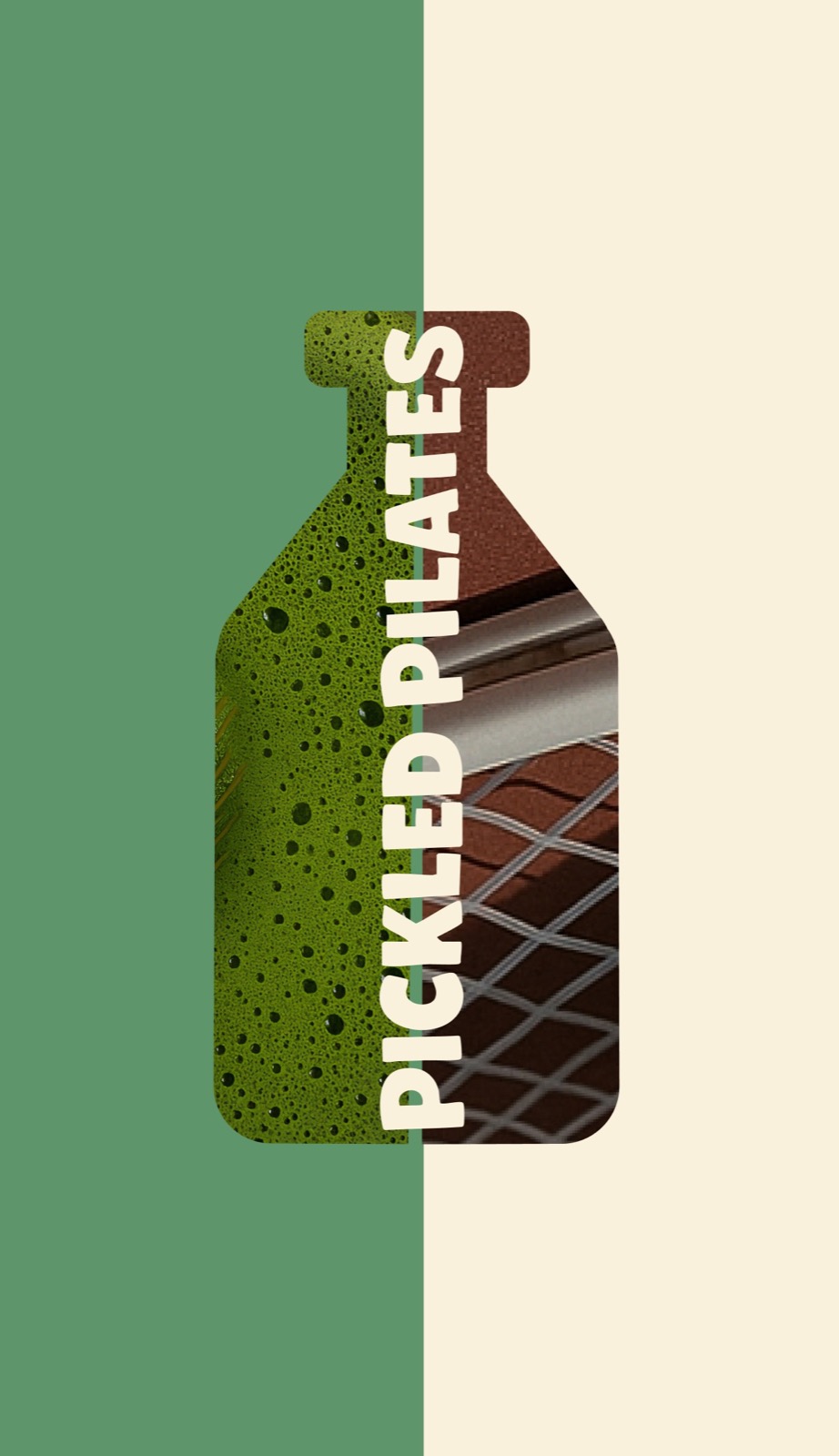
And started designing a bottle.
Specifically, a kombucha bottle.
I cut the silhouette in half.
That form suddenly became:
• Two paddles
• Two P’s
• One health café bottle
One shape, with multiple meanings.
This is where boutique fitness branding becomes elevated.
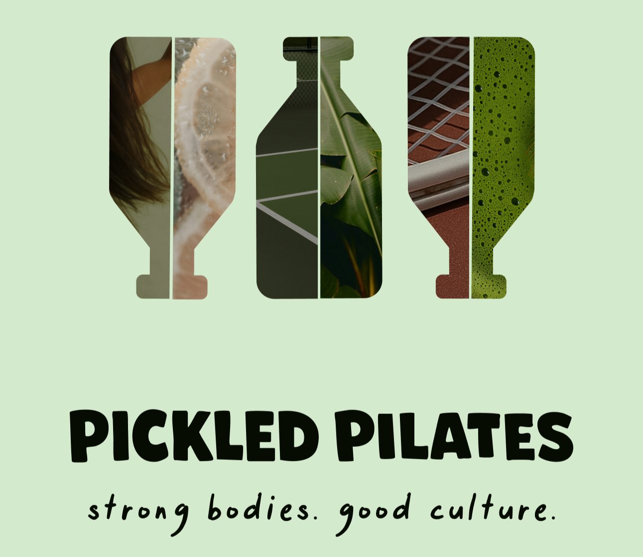
A strong brand mark doesn’t just represent one service.
It represents the architecture of the entire business.
Why This Matters in Fitness Studio Branding
In a competitive wellness market, perception shapes value.
The second someone sees your logo, they decide:
• Is this premium?
• Is this curated?
• Is this intentional?
Or is it another gym?
A cohesive wellness brand identity signals:
This space is designed. This experience is curated. This community is elevated.
That perception is what separates a fitness studio from a destination.
Designing a Brand System (Not Just a Logo)
The Pickled Pilates mark was built to scale.
It works across:
• Street signage
• Court graphics
• Paddle design
• Kombucha cans
• Apparel
• Social media
Minimal. Recognizable. Confident from far away.
Because strong fitness studio branding must operate in physical space, product, and digital environments simultaneously.
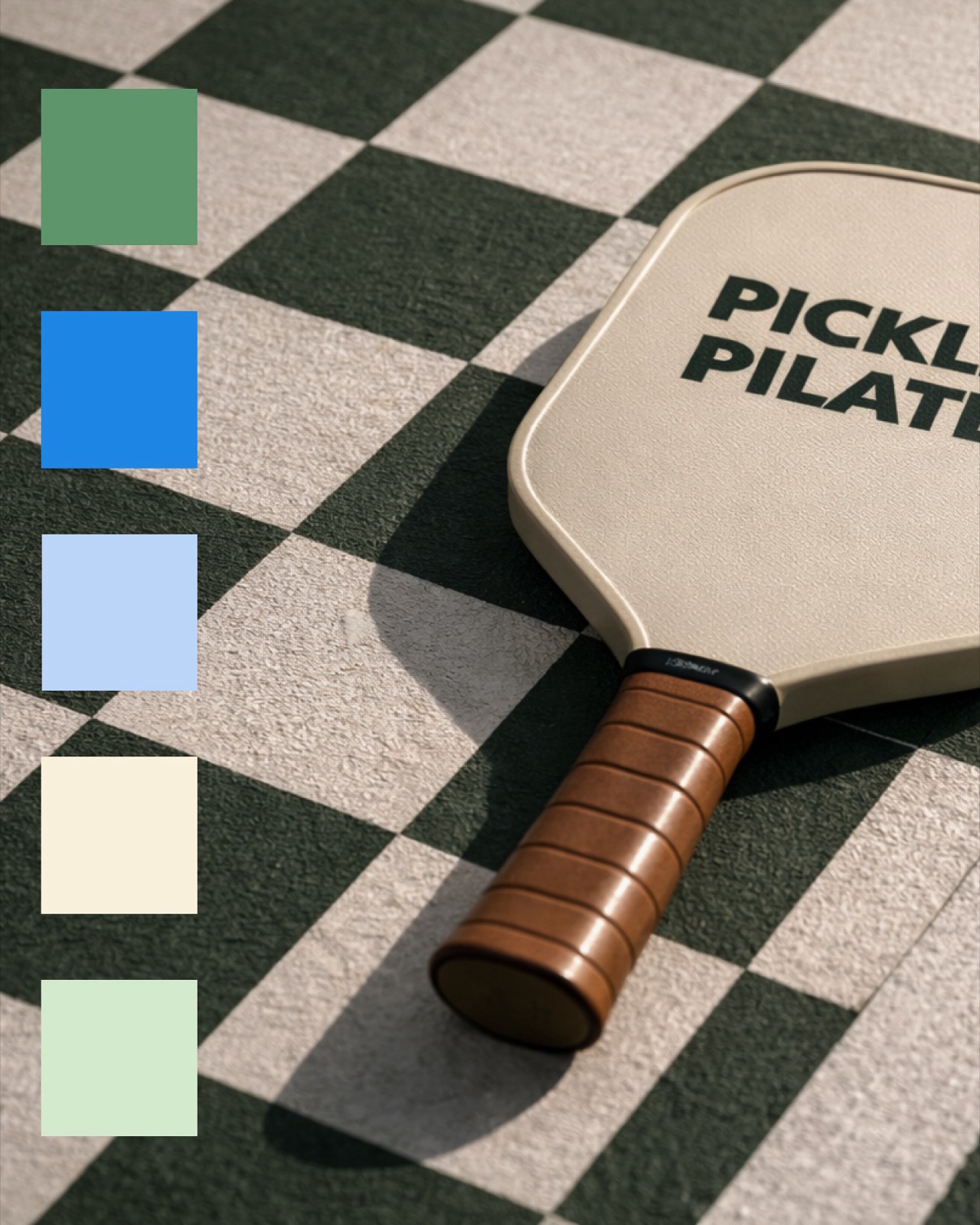
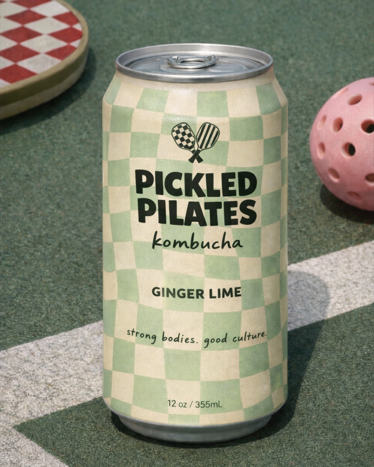
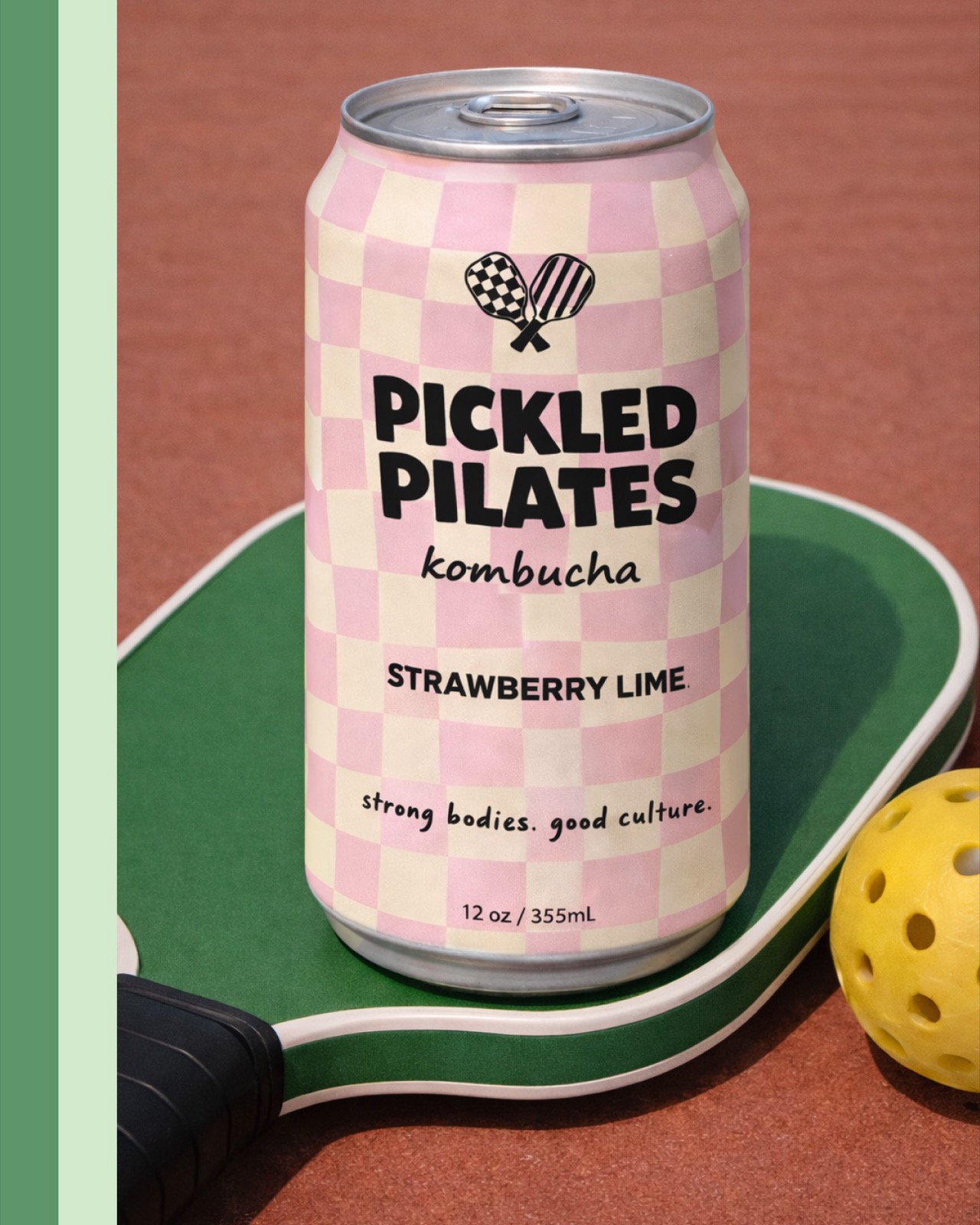
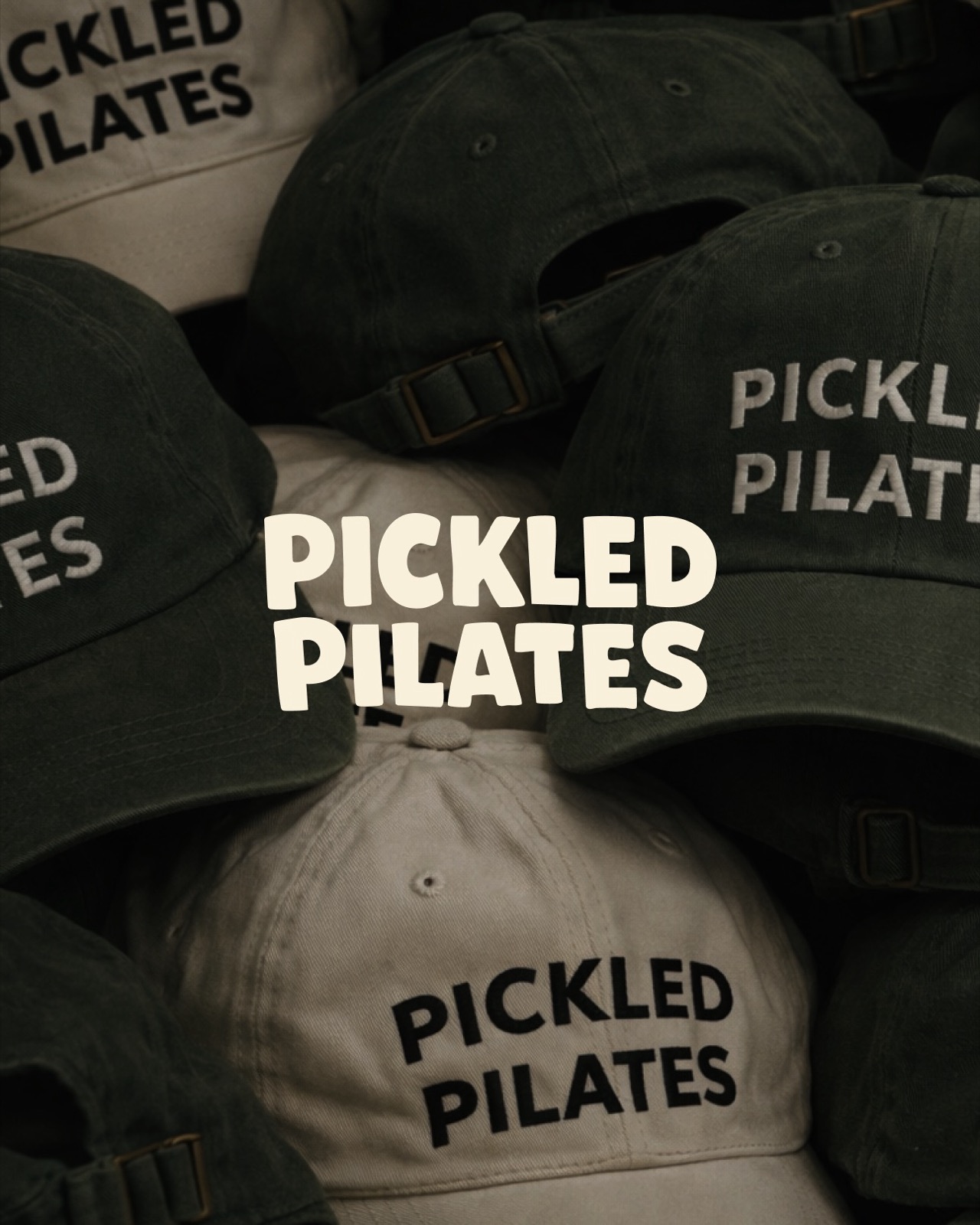
A logo alone doesn’t create that. But a system does.
The Real Lesson for Growing Fitness Businesses
If you’re rebranding a fitness studio or launching a boutique wellness concept, here’s the key:
Visual design only works when positioning is clear.
The reason the early paddle variations failed wasn’t lack of creativity.
It was structural tension.
Once the brand pillars were defined:
Sport, strength, and social wellness. Then the identity came together naturally.
That’s what strategic branding does.
It aligns the business model first, then expresses it visually.
When Is It Time to Rethink Your Brand Identity?
You might need a rebrand if:
• Your services have evolved but your logo hasn’t
• Your space feels more premium than your visuals
• You’re attracting inconsistent clients
• Your brand doesn’t reflect your long-term vision
Rebranding a fitness studio isn’t about changing fonts.
It’s about refining perception.
And perception changes everything.
Ready to Build a Brand That Matches Your Ambition?
Find out what your best next step is for your business, take our 30 second brand assessment quiz.
Take the Quiz
Because the right brand identity doesn’t just look good.
It positions you to grow.