Most running clubs look interchangeable.
Same neon. Same race-day energy. Same “just show up” messaging that could belong to any group chat with a Strava link.
Flow + Go needed something sharper.
It is a women’s running club brand built around one idea:
Find your pace. Go at your flow.
Not louder. Not trendier. Clearer.
This is a case study in fitness community branding — and why a running club identity has to feel like belonging before it feels like merch.
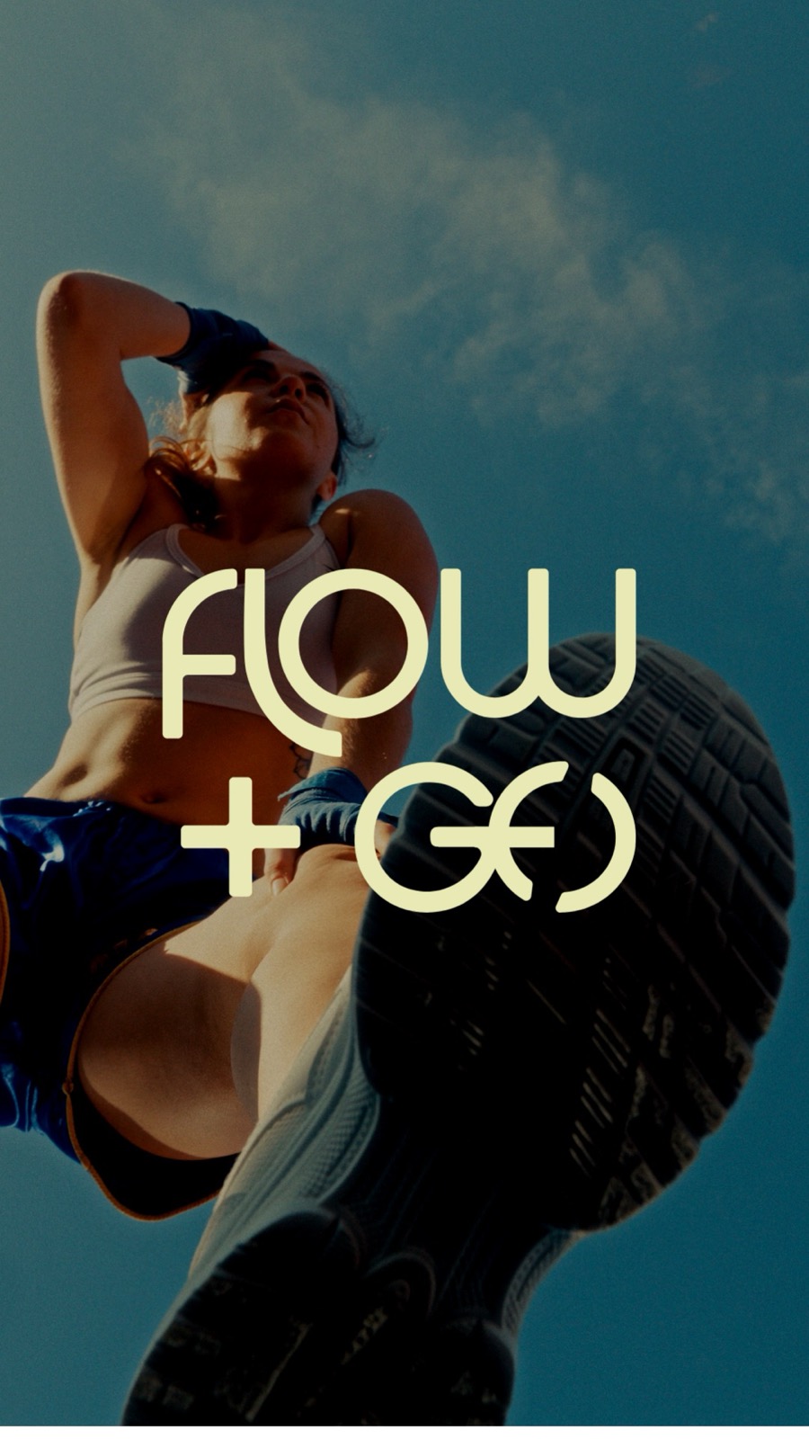
The branding challenge: community without looking generic
A women’s running club sits in an awkward middle.
Lean too hard into hardcore performance, and it starts feeling exclusive.
Lean too soft into wellness, and it loses the run.
Lean into “cute fitness,” and the brand gets dismissed as decoration.
Flow + Go had to hold all three at once:
- Movement that feels personal
- Community that feels real
- Visuals strong enough to live on a road, a phone screen, and a water bottle
That tension is where most fitness branding gets muddy.
When the brand tries to sound like everyone, it ends up sounding like no one.
The strategic idea: pace as permission
The breakthrough was not a prettier logo.
It was the positioning.
Pace became the emotional center of the brand.
Not competition. Not hustle. Not a personality type you have to earn.
Pace gave the club language for women who want consistency, connection, and momentum without performing intensity for an audience.
The line Find your pace, go at your flow did the strategic job:
- It invited beginners and regulars into the same world
- It made the club feel supportive without becoming soft
- It gave every visual decision a filter
If a mark, colour, or graphic did not feel like paced movement, it did not belong.
The logo system: built to move
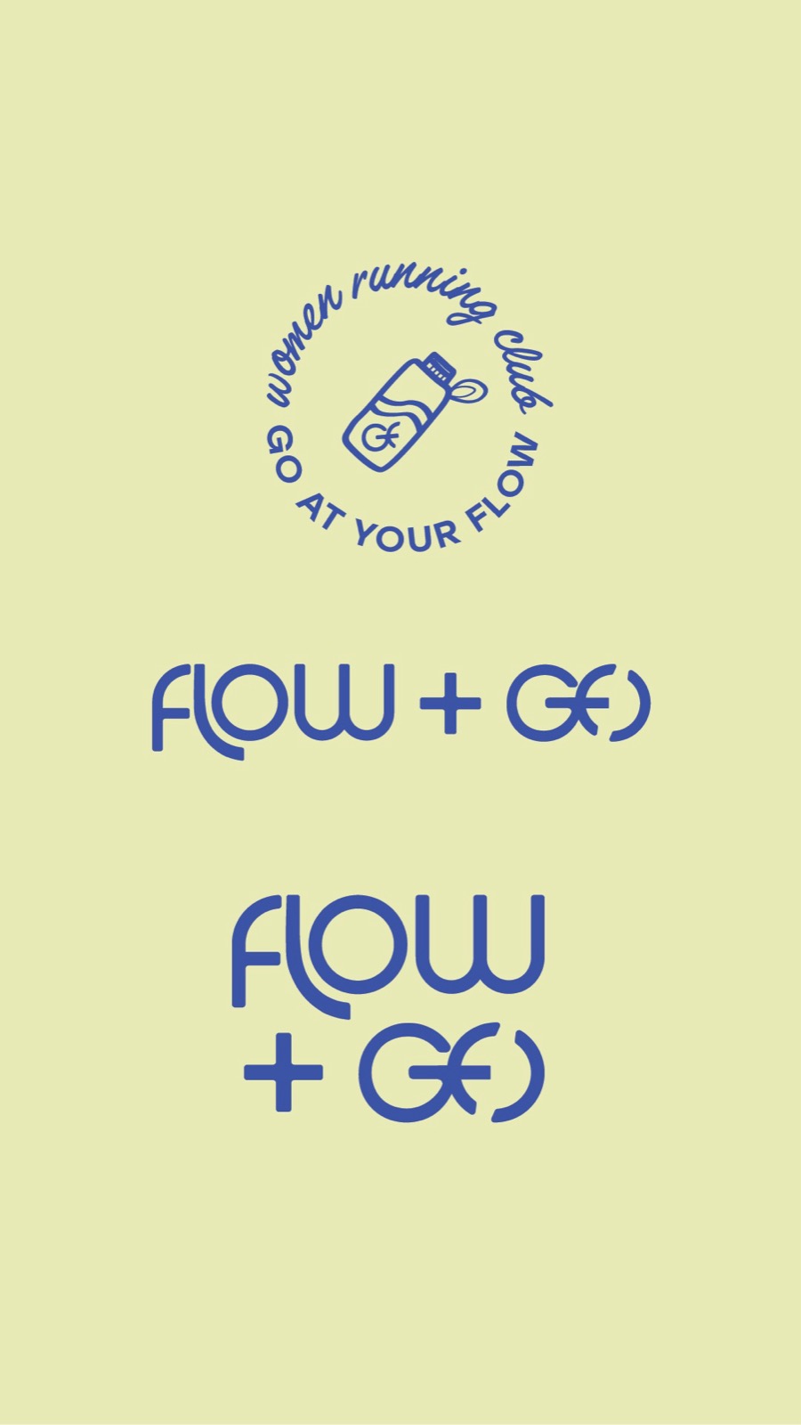
The Flow + Go wordmark was designed as a custom lettering system, not a default font lockup.
The interlocking forms in the O’s and the linked monogram give the brand a signature that still reads quickly at small sizes.
That matters for a running club.
Because the logo has to work:
- Centered on a story frame
- Tiny on a water bottle icon
- Flat on a solid colour field
- Overlaid on real movement photography
The system includes:
- Stacked and horizontal wordmarks
- A circular club emblem
- A linked monogram for tighter applications
- Colourways that can flip between blue, olive, cream, and coral without losing recognition
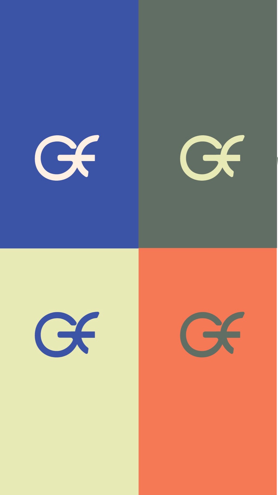
A logo that only works on a white background is not ready for a fitness brand.
Colour, icons, and the feeling of the club
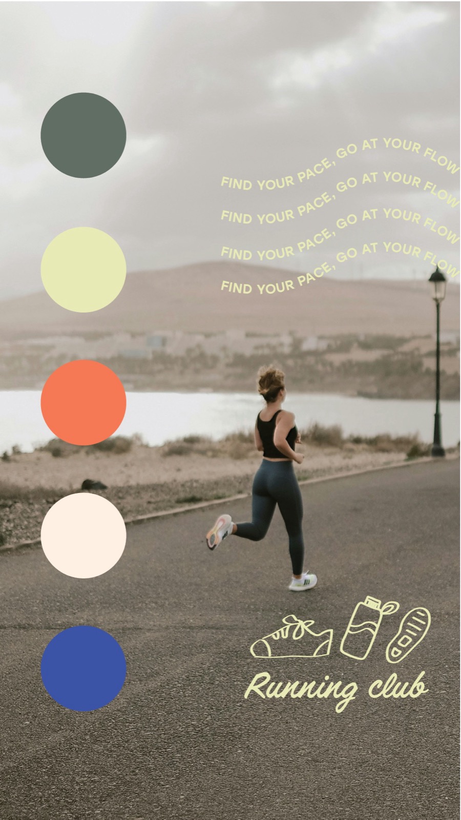
The palette was chosen to feel active without defaulting to neon sports branding.
Blue for clarity and sky.
Olive for grounded outdoor energy.
Coral for heat and push.
Cream and lime for soft contrast on darker photography.
Then the supporting icons — shoe, bottle, sole — turned the brand into something you can recognize even before you read the name.
That is how community brands get remembered.
Not by explaining every offer.
By creating a visual world people want to join.


What this means for fitness and wellness founders
If you are building a studio, club, or community brand, the lesson is simple:
Identity has to carry the culture, not just the category.
A running club that only looks “sporty” will blend into every other running club.
A brand that starts with the emotional offer — pace, belonging, permission — can build a system that stays recognizable across film, social, merch, and launch content.
Flow + Go was designed so the mark, colour, icons, and photography all say the same thing:
You can move at your speed and still belong here.
Ready to build a brand that matches the community you are growing?
If your fitness or wellness brand has outgrown generic visuals, start with a clearer read on what needs work first.
Get Your Brand Score
Because the right identity does not just look stronger.
It makes the right people feel invited.