One signature colour and a few extra shades added whenever a design needs "something else" isn't a brand palette.
But that's how a lot of businesses use colour.
They choose one shade they like, improvise the rest, and then wonder why the website, social content, and campaigns never quite feel connected.
The bigger issue isn't just consistency.
It's that colour is one of the fastest ways people decide whether a business feels playful, premium, grounded, energetic, or completely forgettable.
Used well, a strong palette can shape perception, build recognition, and make future design decisions much easier.
In this article, we will look at:
- why one colour is rarely enough
- how to give each shade a clear job
- how different brands use palettes to communicate three distinct brand personalities
Keep reading to see whether your colours are reinforcing the right brand personality or quietly working against it.
01. One colour isn't a working palette
Don't get me wrong, having a signature colour is a very good start.
It creates recognition and gives people something to associate with your business.
But one colour can't handle every visual job inside a growing brand.
Your website needs light and dark contrast, readable text, buttons, backgrounds, and enough variation to separate one section from the next.
Your social content needs backgrounds and consistent themes for posts and campaigns. Your printed materials need reusable patterns that have slightly different combinations while still looking like they belong to the same business.
Without that range, every new design becomes a small colour emergency.
You choose another shade because it looks close enough, use it once, and then repeat the whole process the next time something needs to be created.
That is usually how a brand ends up with 20+ colours and no actual colour direction.
For most businesses, I recommend building a working palette of around six to eight colours.
That doesn't mean using all eight at once!!!!
It means having enough options to create variety without improvising every time.
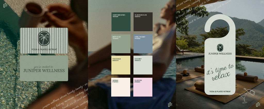
The brand concept of Juniper Wellness is a good example.
The brand could have stopped at green, but one shade of green wouldn't give a premium retreat brand enough range.
Deep green creates recognition and grounds the identity, while sage, muted blue, cream, pale yellow, and soft pink add warmth, contrast, and flexibility.
Together, the palette can move across invitations, social content, a website, signage, and retreat materials without losing its calm, elevated feeling.
A useful palette will usually include:
- one primary colour that carries recognition
- two or three supporting shades
- a light neutral for backgrounds
- a dark neutral for text and contrast
- one accent colour for buttons, launches, or important moments
- an optional softer tint for flexibility
The goal is to give every colour a clear purpose and remove the guesswork from future design decisions.
02. Choose colours for your customer, not just yourself
You should absolutely like your brand colours... but your audience should like them more.
A lot of founders start with personal taste.
They love green, hate orange, or arrive with a Pinterest board full of soft neutrals.
That's useful information, but it can't make the whole decision.
Your palette also has to make sense for the business you're building and the people you want to attract.
A wellness clinic may need to feel calm, credible, and reassuring.
A swimwear brand can be playful, expressive, and unexpected.
A performance studio might need more contrast, energy, and visual intensity.
The shade matters too. Dusty pink creates a very different impression from hot pink.
That's why colour psychology should be treated as a guide, not a cheat sheet.
Before you choose a palette, ask:
- Who should feel drawn to this business?
- What should the experience feel like?
- What level of pricing and service should the visuals support?

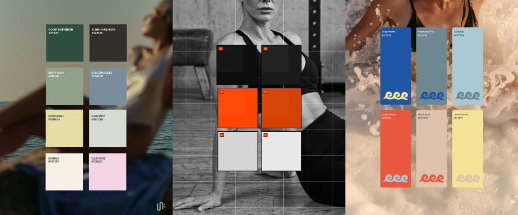
For Stolen Summer, the goal wasn't just to communicate swimwear.
The brand needed to feel nostalgic, social, expressive, and attainable premium.
That is why bold coral, yellow, and royal blue were chosen to attract an audience who wanted swimwear that feels fun and summery.
Those stronger colours are balanced with cream, soft blue, and white, giving the palette enough range to work across the website, social content, and campaigns without feeling overwhelming.
Your favourite colour can absolutely belong in your brand. It just needs a strong reason for being there.
Once you know what the palette needs to communicate, the next step is giving every colour a clear job.
03. Give every colour a job
Choosing the colours is only half the work.
The real question is how much space each colour gets and where it should appear.
In this next brand design concept, made for an intense and premium pilates business, it shows how to balance colours.
REFORMR uses bright orange as a signal. It highlights key words, movement, app actions, and the moments that need immediate attention.
Most of the visual space stays black, white, or grey.
That balance is what gives the orange its impact.
If every background, headline, and graphic used the brightest colour, it would stop feeling distinctive very quickly.
The accent only works because the rest of the palette gives it room.

This is where colour hierarchy matters.
Here are some quick colour tips:
- Your primary colour doesn't need to appear everywhere.
- An accent colour should feel deliberate.
- Neutrals may be less exciting, but they create the structure that lets the stronger colours do their job.
A simple way to test your palette is to look at your website, social content, and campaigns together.
Can you tell which colour builds recognition, which one directs attention, and which colours create balance?
If the answer changes with every design, the palette may be attractive, but it isn't working as a consistent brand tool yet.
Your brand colours should do more than look good beside each other.
They should reflect the personality of the business, connect with the right audience, and make every future design decision easier.
You don't necessarily need louder colours or more of them.
You need a palette where every shade has a reason for being there.
If your business is still relying on one signature colour, a collection of shades chosen on the fly, or a palette that no longer reflects the brand you're building, Jaia Studio can help you turn it into a complete custom identity.
For a quieter wellness look, 5 Ways to Make Your Wellness Brand Feel More Luxurious looks at how colour, type and photography work together.
Start a Project Inquiry to talk about Visual Branding, or explore Visual Branding to see how colour work fits into a full brand system.