Brand Strategy · October 6, 2026 · 5 min read · Jaia Studio
Event Poster Design: 5 Tips for Wellness Studios
A good event poster has two jobs: catch someone's attention and make the invitation clear. Here are five decisions that help it do both.
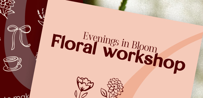
Florencia Wellness floral workshop artwork shown in two colour treatments.
A poster can look beautiful and still leave people wondering what they're being invited to. That's the hard part of designing a class flyer or workshop graphic: you have to catch someone's attention and help them decide whether the event is for them.
I've been creating workshop content for Florencia Wellness. The floral artwork shown here is a good example of how much thinking can sit behind a small piece of design. The event has a name, a feeling, and a clear activity. Each needs its place.
If you're promoting a class, workshop, or retreat, these are the five decisions I'd make before calling the poster finished.
1. Tell people what they're being invited to do
“Evenings in Bloom” gives Florencia's workshop its personality. “Floral Workshop” tells a new person what it actually is. In the artwork, Floral Workshop has the biggest, boldest type. Someone scrolling past can understand the invitation before they know the event's name.
That order matters because you're much closer to your event than the people seeing it. A name that's obvious to your team may be a puzzle to someone encountering your business for the first time. You can keep the expressive name; just make the activity easy to grasp alongside it.
The smaller line, “Come solo or bring a friend,” answers another question someone may have before booking: Will I feel comfortable going? Useful copy can do more than describe the event. It can remove a reason to hesitate.
Try showing your graphic to someone who hasn't heard of the event. If they can't tell you what they'll be doing within a few seconds, change the headline before changing the colours or illustrations.
2. Make the essential details easy to find
Once someone is interested, they'll look for the practical details. What day is it? Where is it? How much does it cost? How do they reserve a spot?
The image here is a presentation mockup showing two colour treatments; it isn't a final event announcement. A standalone post or printed flyer would need the details that let someone act. Put date and time together. Keep the location and price, when relevant, easy to find. Give the booking step enough emphasis to be spotted without searching the whole graphic.
You don't need to squeeze the full event description onto the poster. A clear activity, a reason to care, the essential details, and one next step are usually enough. Let the booking page explain the rest.
Florencia's piece brings together soft-focus flower photography, botanical line drawings, a curved shape, and a pairing of bold and delicate type. The burgundy and peach versions feel different, but those shared elements make them recognisably related.
The flower drawings make sense for a floral workshop. They support the experience rather than simply filling space. That doesn't mean every event from the same studio needs flowers or the same exact layout. It means the choices should feel connected to the business and appropriate for what's being offered.
Before making a new graphic, look at the photography, type, colours, and shapes your audience already associates with you. A strength class and a quiet retreat may need different images, but both can still look like they belong to your studio.
A poster can be easy to read in a large design file and difficult to read in a feed. Open the actual social export on your phone without zooming in. Can you still read what the event is? Can you find the date and the way to book?
Check the version that will be shared, too. A screenshot may travel without its caption, so don't make the caption do all the work of explaining the event. If it's a printed flyer, check a flat print at its real size. Test the booking link or QR code before anything goes out; a short URL gives people another way in.
One quick test is to ask someone outside the planning team to look at the finished piece for five seconds. Ask what the event is and what they'd do next. Their answer will show you whether the design is helping or making them search.
5. Make the next poster easier to create
If you run classes and workshops regularly, the most useful part of an approved poster may be the decisions you can reuse. Keep an editable version and a short note explaining the headline style, where event details go, which images feel right, and how the booking step should appear.
That gives your team a starting point for the next event. It also makes an AI tool easier to direct if you're using one. Give it the real event details, the approved artwork, your brand files, and the format you're designing for. Ask it to flag what's missing instead of inventing a date, price, or location. Then check the result at its final size.
Answer those five questions before anyone starts moving type around.
When your brand is clear enough to guide decisions like these, each new event doesn't have to begin from scratch. If your team is still guessing how your business should look every time you promote something, the next step is a brand system the team can actually use. That's the work we do at Jaia Studio: creating the identity and practical direction behind the everyday pieces your audience sees.